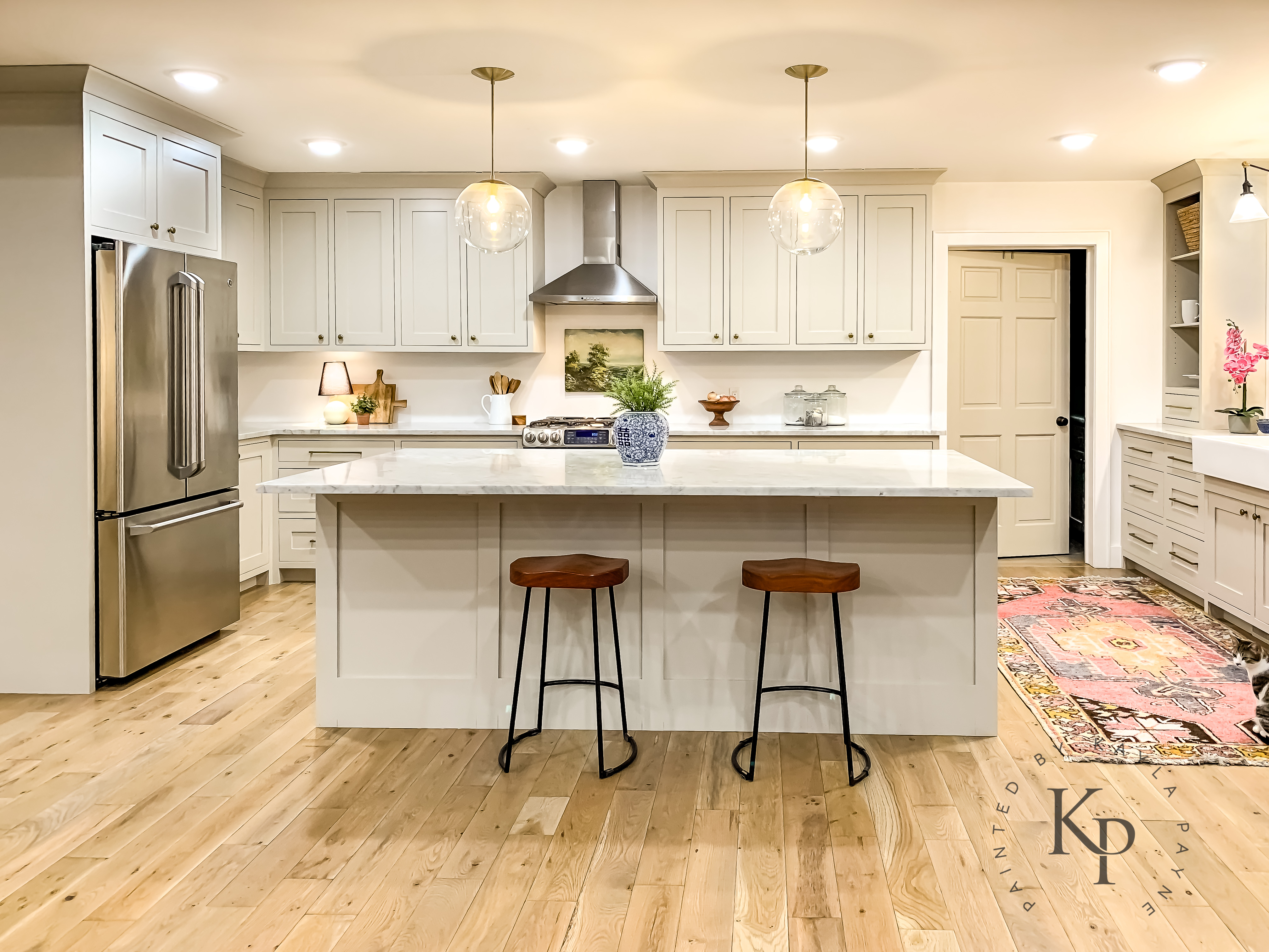
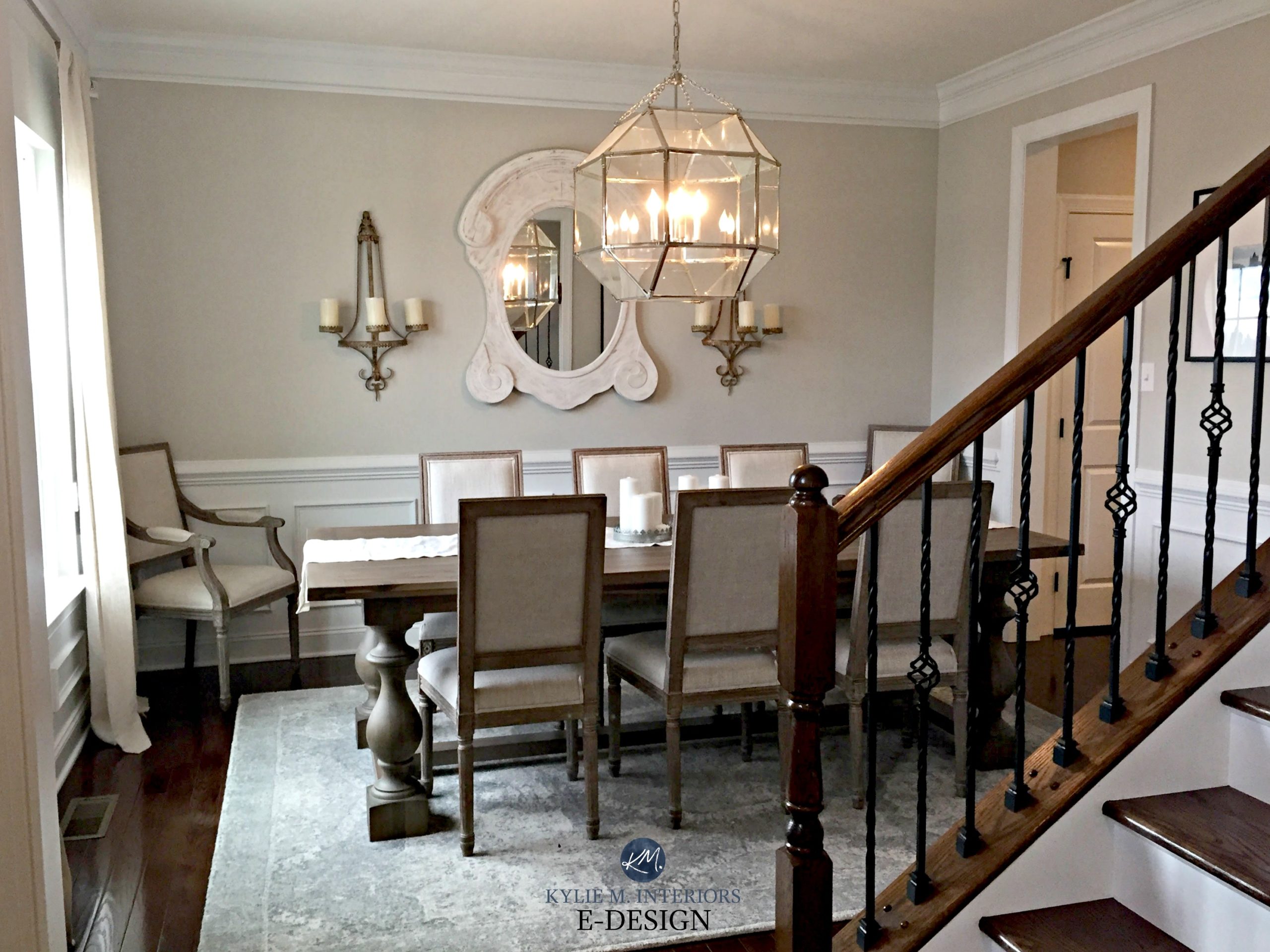
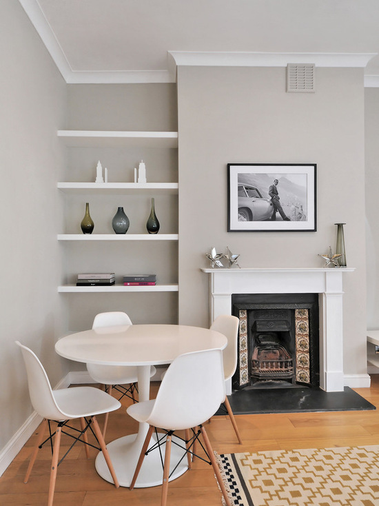
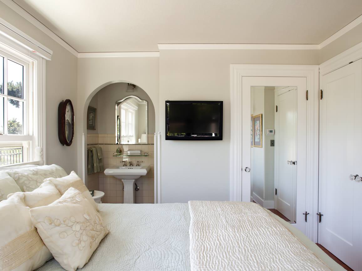
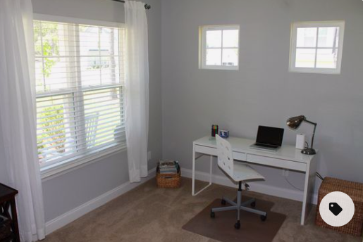
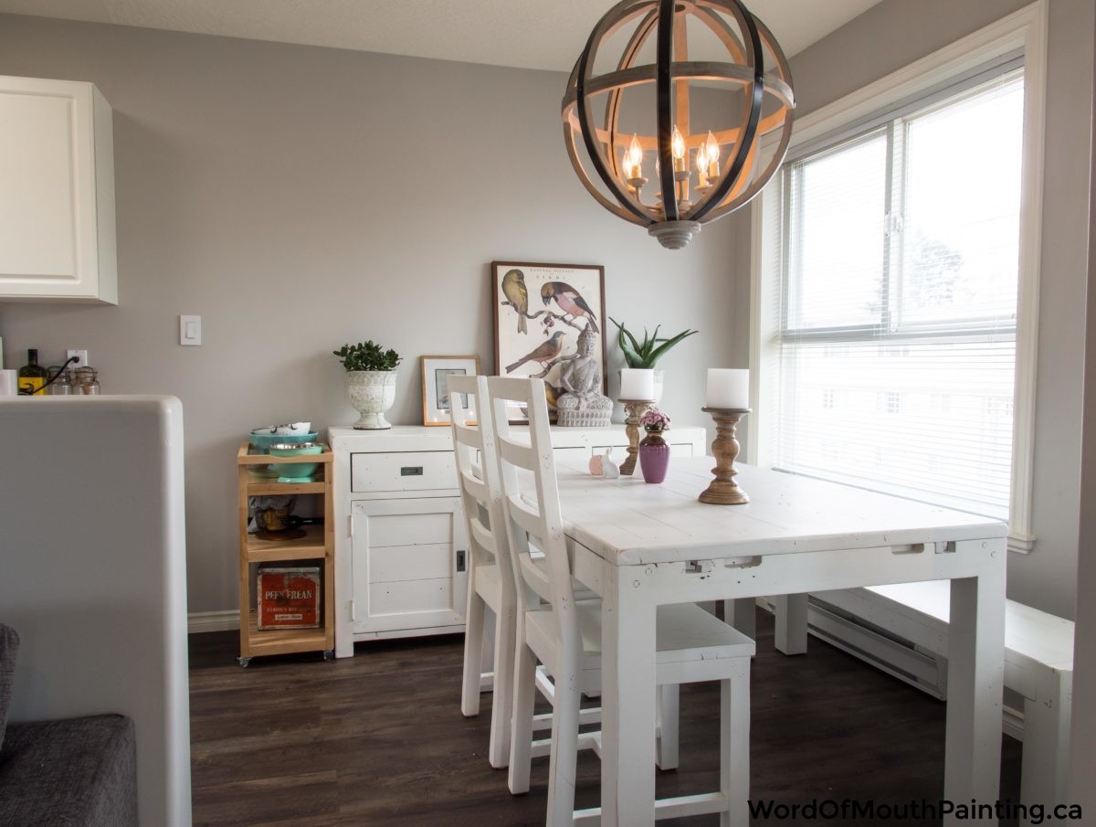
When it comes to choosing a paint color for your living room, it can be overwhelming to sift through the endless options available. However, there is one color that consistently ranks as a top choice among homeowners and interior designers alike: Benjamin Moore Revere Pewter. This classic neutral shade offers a timeless appeal that can complement any design style and bring a sense of sophistication to your living space. Revere Pewter is a warm gray with subtle beige undertones, making it a versatile choice that can work well with both cool and warm color palettes. It has a chameleon-like quality, appearing more gray in some lighting and more beige in others. This makes it a perfect choice for those who want a neutral color that can adapt to different environments. One of the reasons why Revere Pewter is so popular is its ability to create a warm and inviting atmosphere in a living room. It's not too dark or too light, striking a perfect balance that can make a room feel cozy and welcoming. Plus, its understated elegance can add a touch of sophistication to any space. If you're looking to create a monochromatic color scheme in your living room, Revere Pewter is an excellent choice. It pairs well with other shades of gray, as well as white and beige. You can also add pops of color through artwork, pillows, and other accessories to add interest and personality to the room. Benjamin Moore Revere Pewter: A Classic Neutral with a Timeless Appeal
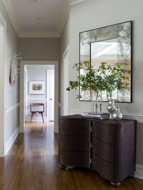

Benjamin Moore Revere Pewter


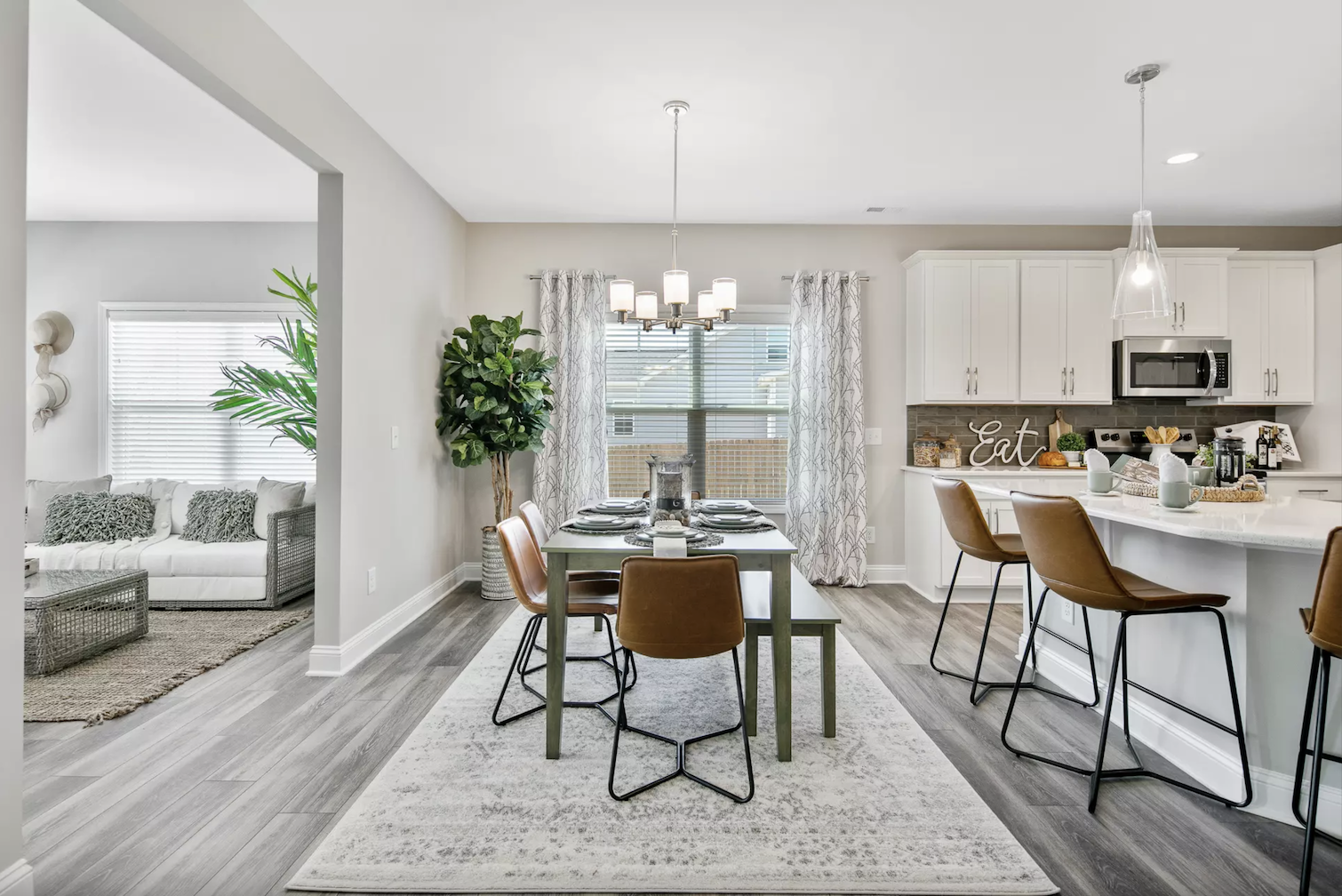
For those who prefer a cooler tone for their living room, Sherwin Williams Agreeable Gray is a top pick. This light gray has a slight blue undertone, giving it a calm and serene vibe that can help create a relaxing atmosphere in your living space. Agreeable Gray is a versatile color that can work well with both traditional and modern design styles. It's a great option for those who want a light and airy feel in their living room while still maintaining a sense of warmth and coziness. This shade also has the ability to make a room look larger, making it ideal for smaller living spaces. You can pair Agreeable Gray with other cool tones such as blues and greens, or warm it up with touches of wood and metallic accents. It also works well with crisp white trim and molding, creating a beautiful contrast that can add depth to your living room. Sherwin Williams Agreeable Gray: A Soft and Serene Option

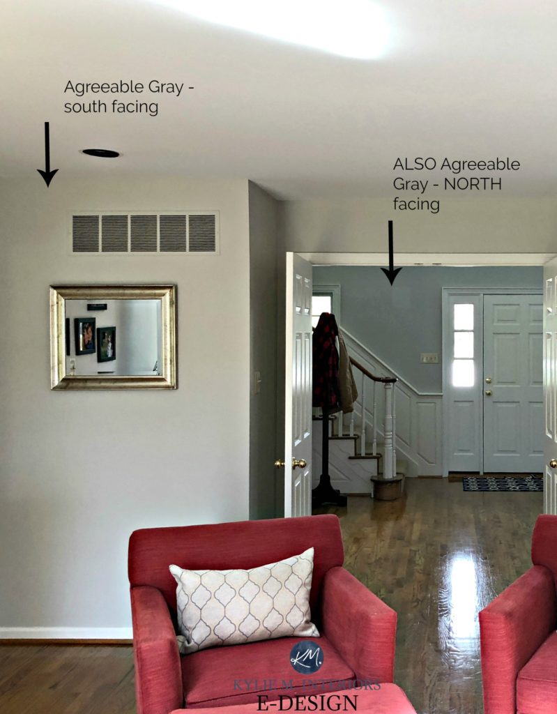
Sherwin Williams Agreeable Gray


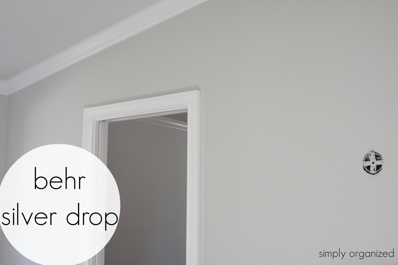
If you're searching for a light and airy color that still has depth and character, look no further than Behr Silver Drop. This pale gray has a subtle hint of blue-green undertones, giving it a soft and sophisticated look that can work well in any living room. Silver Drop is a great option for those who want to create a calming and serene atmosphere in their living room. It has a neutral base that can pair well with a variety of color schemes, making it a versatile choice for any design style. It also has a touch of warmth to it, which can add a cozy feel to your living space. This shade is also a popular choice for those who want to create a monochromatic color scheme in their living room. It works well with other shades of gray, as well as whites and beiges. You can also add accents of soft pastel colors, such as blush pink or light blue, to add a touch of sweetness and femininity to the room. Behr Silver Drop: A Subtle and Sophisticated Choice


Behr Silver Drop


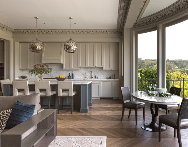
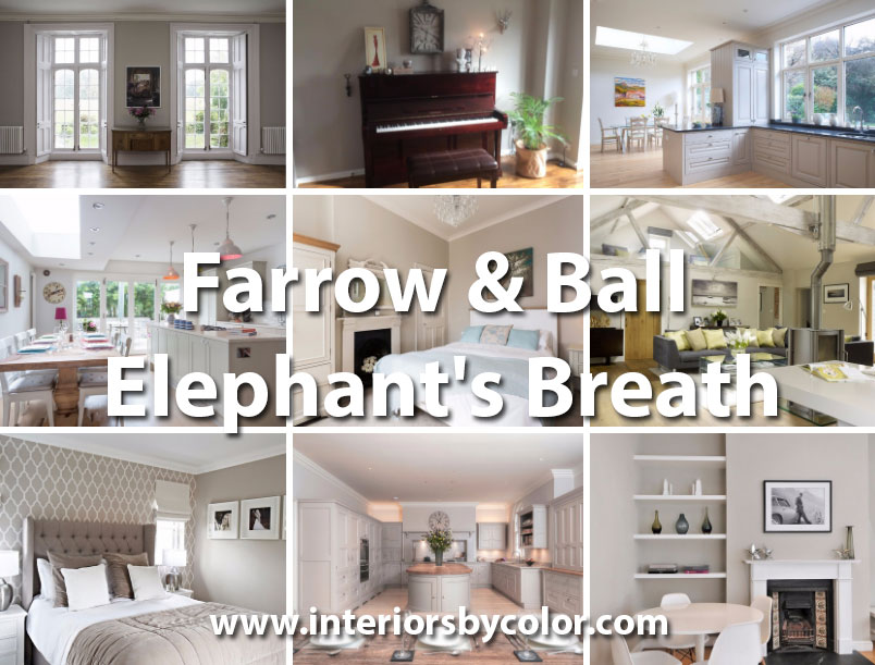
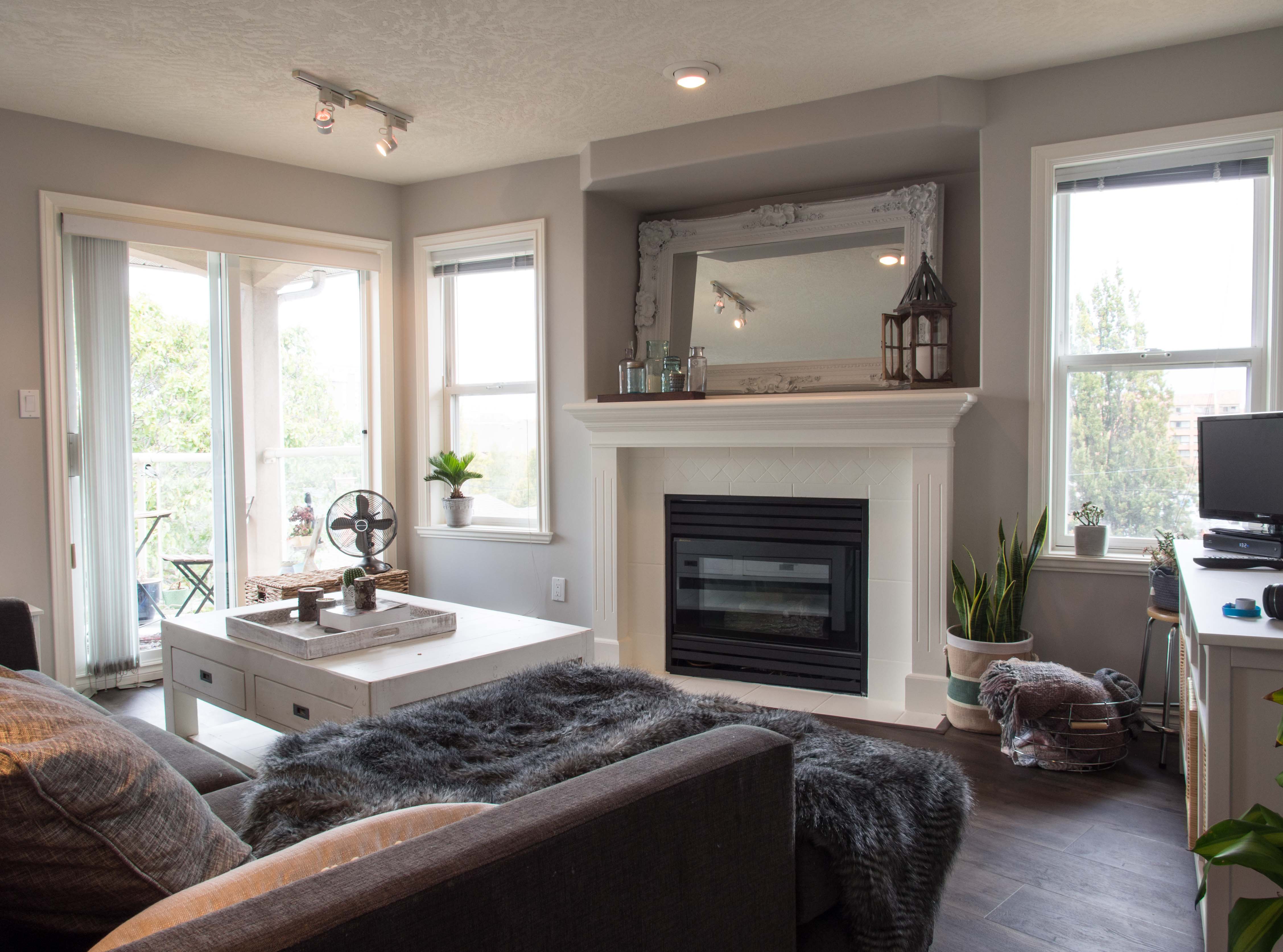
For those looking to add a touch of luxury to their living room, Farrow & Ball Elephant's Breath is a top contender. This warm and rich gray has a slight pink undertone, giving it a soft and elegant look that can add a sense of opulence to your living space. Elephant's Breath is a popular choice for those who want to create a dramatic and moody atmosphere in their living room. It's a bold color that can make a statement on its own, or pair well with other deep and rich shades. It also works well with metallic accents, such as gold or copper, adding a touch of glamour to the room. This shade is also a great option for those who want to create a cozy and intimate feel in their living room. Its warmth and depth can make a room feel more intimate and inviting, perfect for those who love to entertain or spend quality time with their loved ones. Farrow & Ball Elephant's Breath: A Rich and Luxurious Option


Farrow & Ball Elephant's Breath


If you're looking for a classic and versatile gray that will stand the test of time, Valspar Gray Screen is a top pick. This light gray has a slight green undertone, giving it a fresh and clean look that can work well with a variety of design styles. Gray Screen is a great option for those who want a neutral color that won't overpower other elements in the room. It's a subtle shade that can create a calming and relaxing atmosphere in your living space. It also has a timeless quality to it, making it a safe and reliable choice for those who want a color that won't go out of style. You can pair Gray Screen with other shades of gray for a monochromatic look, or add pops of color through accents and accessories. It also works well with natural materials, such as wood and stone, adding a touch of warmth and texture to the room. Valspar Gray Screen: A Versatile and Timeless Choice


Valspar Gray Screen


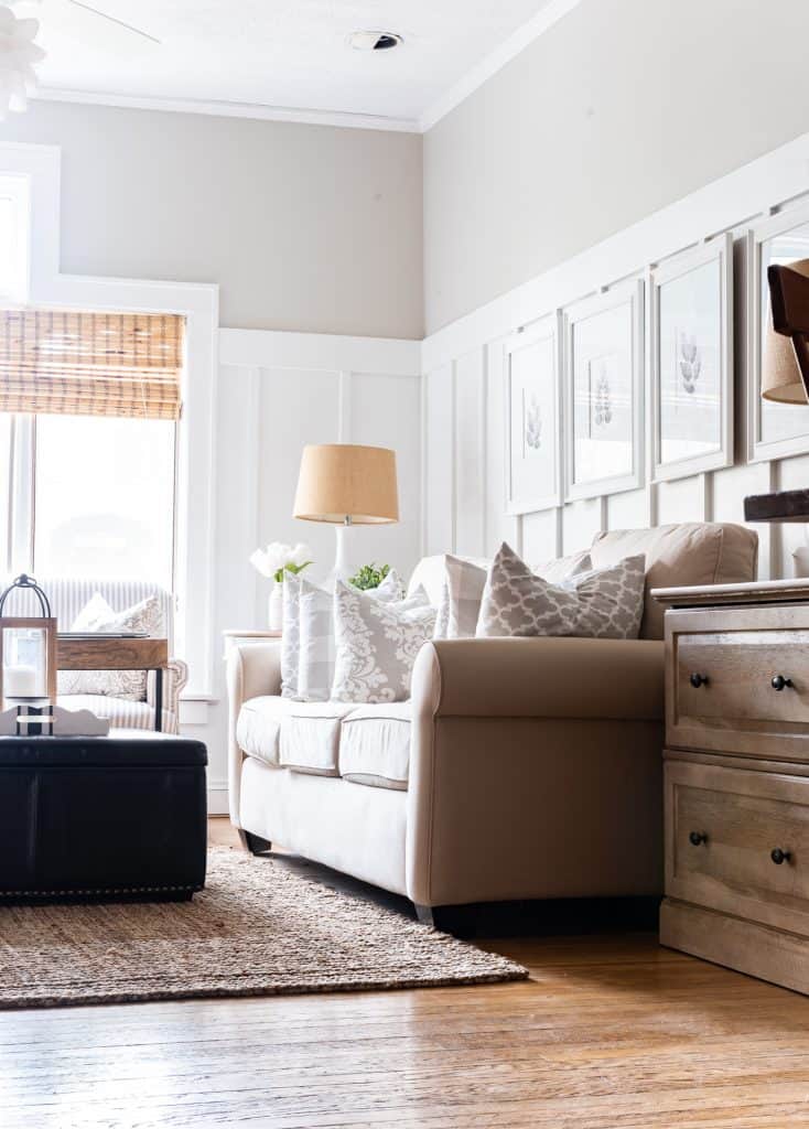
Benjamin Moore Edgecomb Gray is a popular choice for those who want a warm and inviting color for their living room. This light taupe shade has a touch of gray and beige, creating a versatile and neutral color that can work well with a variety of design styles. Edgecomb Gray is a great choice for those who want to create a cozy and inviting atmosphere in their living room. It has a soft and subtle warmth to it, making it perfect for those who want a neutral color that still feels welcoming and homey. It also has the ability to make a room feel larger, making it ideal for smaller living spaces. This shade also pairs well with other warm tones, such as yellows and oranges, creating a cheerful and uplifting atmosphere in the room. You can also add pops of color through artwork and accessories to add interest and personality to your living space. Benjamin Moore Edgecomb Gray: A Warm and Inviting Option

Benjamin Moore Edgecomb Gray

.jpg)


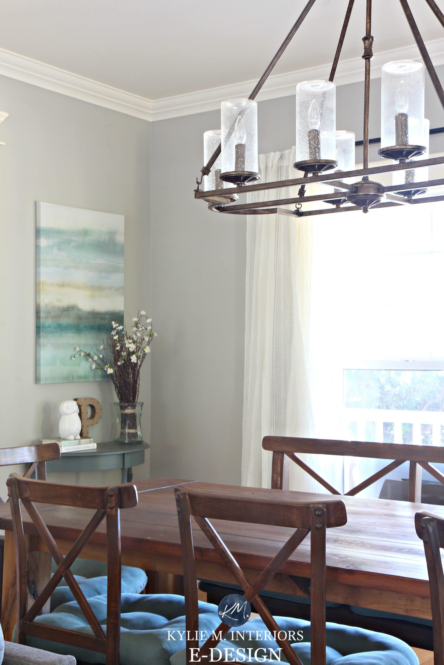
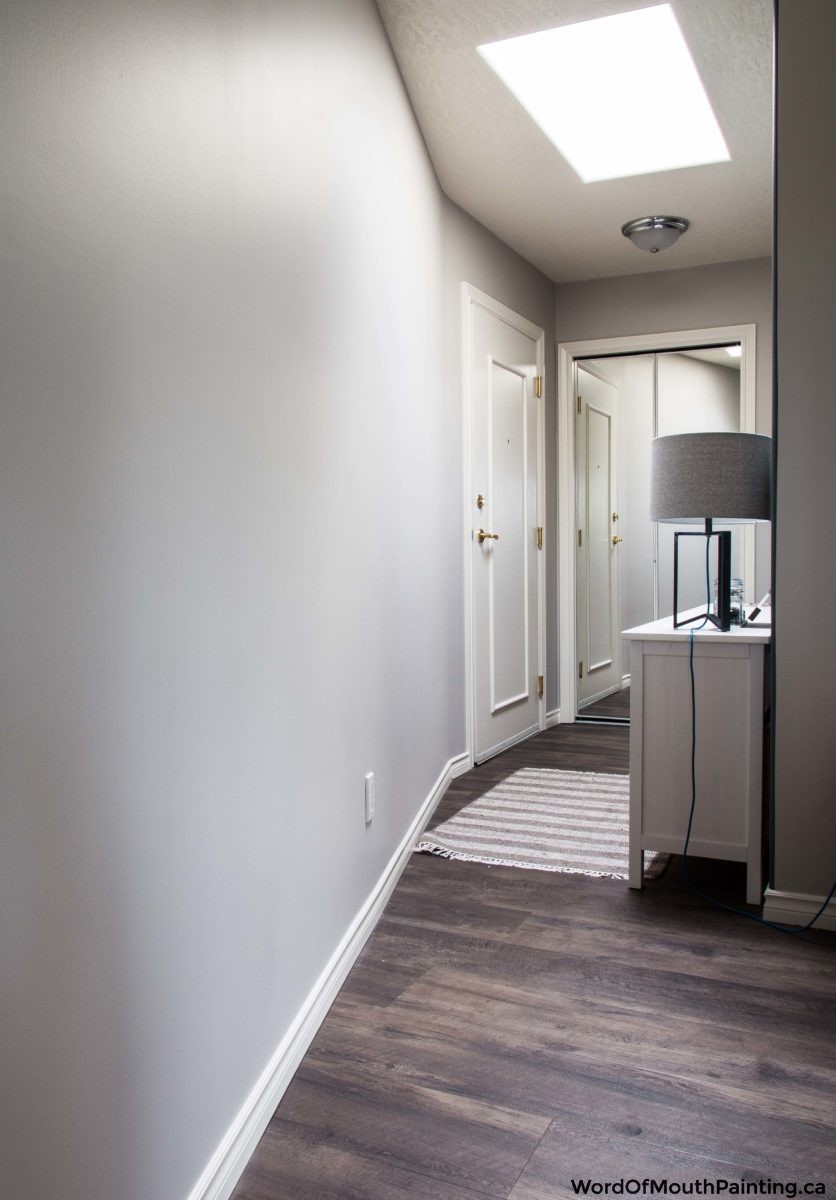
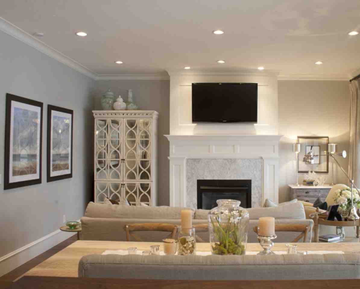
If you're looking for a subdued and elegant color for your living room, Sherwin Williams Repose Gray is a top contender. This warm gray has a slight beige undertone, giving it a soft and sophisticated look that can work well with a variety of design styles. Repose Gray is a great option for those who want a neutral color that is not too dark or too light. It's a versatile shade that can work well with both cool and warm color palettes, making it a safe choice for those who are unsure of which direction to go in. It also has a calming quality to it, making it perfect for those who want a tranquil and serene living space. This shade is also a popular choice for those who want to create a timeless and classic look in their living room. It pairs well with other neutrals, as well as pops of color for a more dynamic and personalized space. Sherwin Williams Repose Gray: A Subdued and Elegant Choice


Sherwin Williams Repose Gray


For those who want a light and airy color for their living room, look no further than Behr Dolphin Fin. This pale gray has a slight blue undertone, giving it a cool and refreshing look that can create a sense of openness and spaciousness in your living space. Dolphin Fin is a great option for those who want a neutral color that can provide a clean and crisp backdrop for other design elements. It's a versatile shade that can work well with a variety of color schemes, making it a practical choice for those who like to switch up their home decor often. It also has a calming effect, making it perfect for those who want a peaceful and serene living room. This shade is also a popular choice for those who want to create a beachy and coastal feel in their living room. It pairs well with other shades of blue and green, as well as natural materials such as rattan and driftwood, adding a touch of seaside charm to the room. Behr Dolphin Fin: A Light and Airy Choice


Behr Dolphin Fin


Farrow & Ball Cornforth White is a top choice for those who want a timeless and elegant color for their living room. This warm gray has a subtle hint of pink, giving it a delicate and sophisticated look that can add a touch of luxury to your living space. Cornforth White is a versatile color that can work well with a variety of design styles. It's a great choice for those who want a neutral color that is not too bold or too muted. It also has a subtle warmth to it, making it perfect for those who want a cozy and inviting living room. This shade is also a popular choice for those who want to create a monochromatic color scheme in their living room. It pairs well with other shades of gray, as well as pops of color for a more dynamic and personalized space. You can also add metallic accents, such as silver or chrome, to add a touch of glamour to the room. Farrow & Ball Cornforth White: A Timeless and Elegant Classic

Farrow & Ball Cornforth White


.jpg)
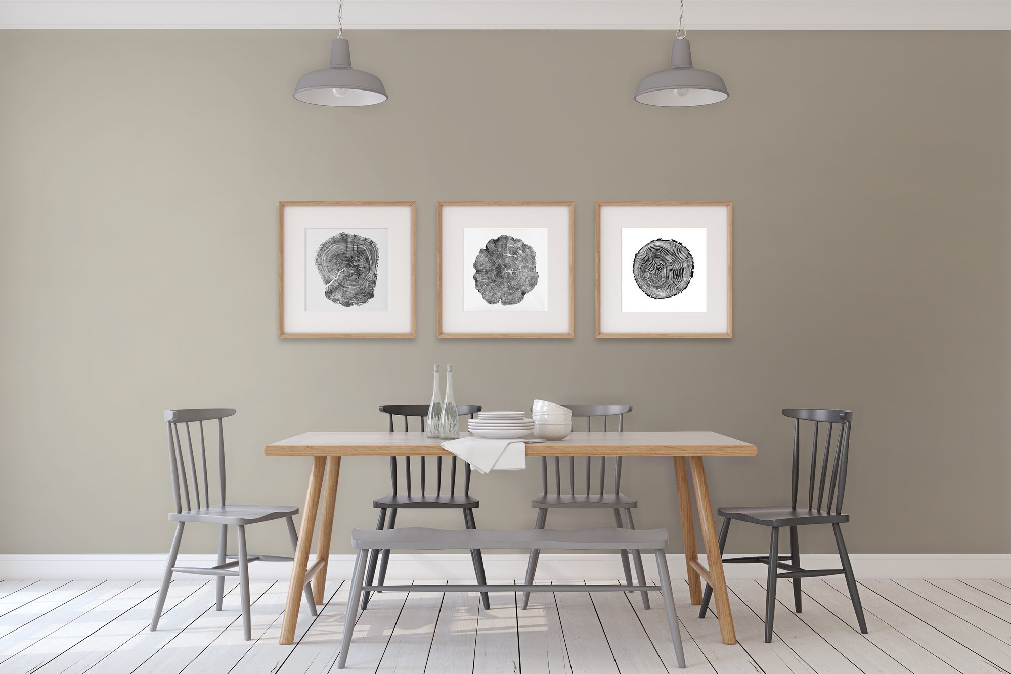
For those who prefer a more traditional and formal look in their living room, Valspar Woodlawn Colonial Gray is a top pick. This rich and deep gray has a hint of blue undertone, giving it a classic and elegant appeal that can add a touch of sophistication to your living space. Woodlawn Colonial Gray is a great option for those who want to create a moody and dramatic atmosphere in their living room. It's a bold color that can make a statement on its own, or pair well with other deep and rich shades. It also has a timeless quality to it, making it a safe and reliable choice for those who want a color that won't go out of style. This shade is also a popular choice for those who want to create a formal and refined look in their living room. It pairs well with other neutrals, as well as pops of color for a more dynamic and personalized space. You can also add accents of gold or brass to add a touch of glamour and elegance to the room. Valspar Woodlawn Colonial Gray: A Sophisticated and Traditional Choice


Valspar Woodlawn Colonial Gray


Choosing the Perfect Paint Color for Your Living Room
The Importance of Choosing the Right Paint Color
 The living room is often considered the heart of the home, where families and friends gather to relax and spend quality time together. It's also the first room that guests see when they enter your home. Therefore, it's essential to choose the perfect paint color for your living room to create a welcoming and inviting atmosphere. The right color can make a significant impact on the overall design of your house and can set the tone for the rest of your home.
The most popular paint color for living rooms is a crucial decision that requires careful consideration.
The living room is often considered the heart of the home, where families and friends gather to relax and spend quality time together. It's also the first room that guests see when they enter your home. Therefore, it's essential to choose the perfect paint color for your living room to create a welcoming and inviting atmosphere. The right color can make a significant impact on the overall design of your house and can set the tone for the rest of your home.
The most popular paint color for living rooms is a crucial decision that requires careful consideration.
Factors to Consider When Choosing a Paint Color
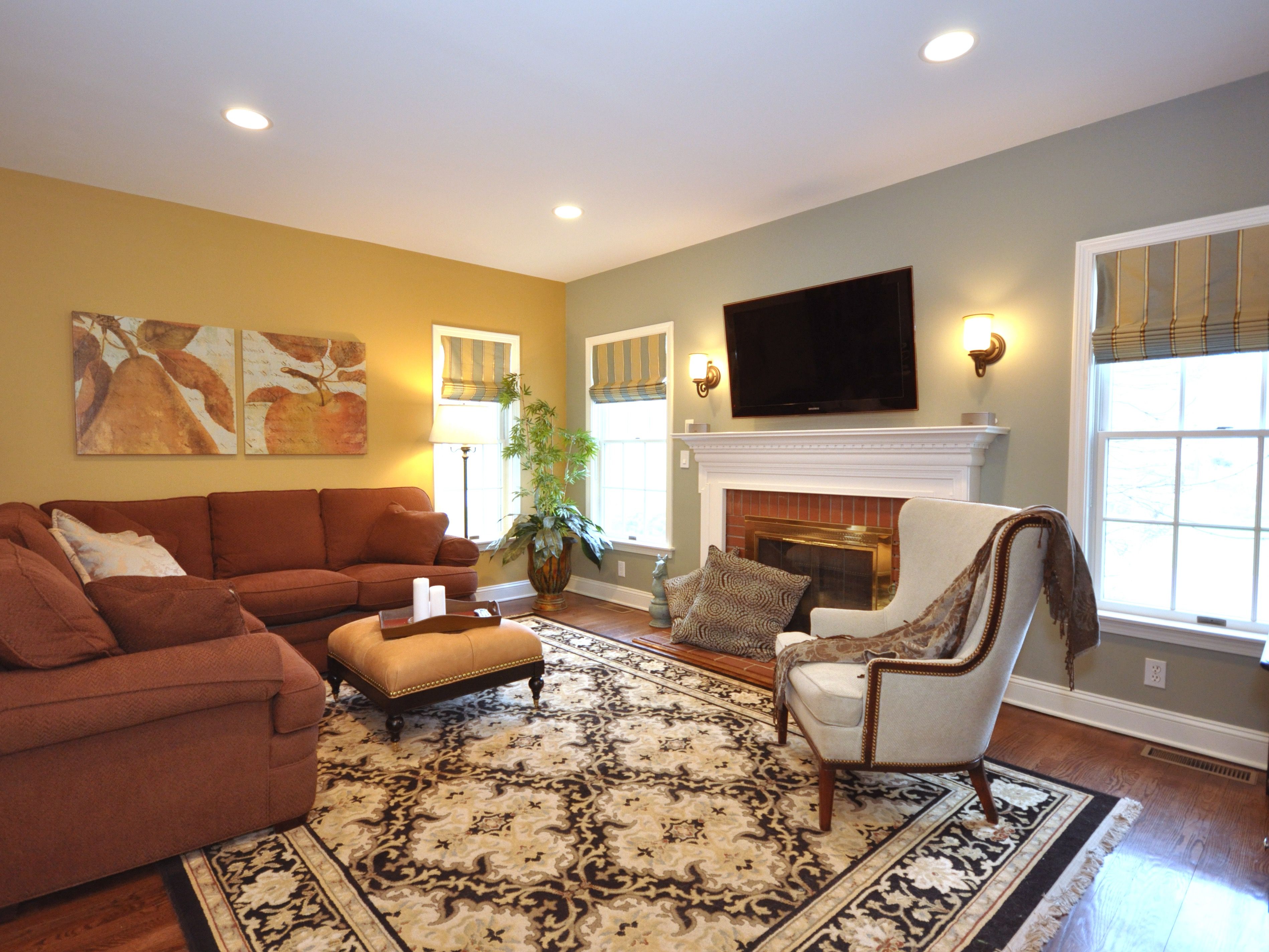 When selecting a paint color for your living room, there are several factors to consider. Firstly, consider the size and layout of your living room. Lighter colors tend to make a room feel more spacious, while darker colors can make a room feel smaller and cozier. Secondly, think about the style and design of your home. For a modern and sleek look, neutral colors like beige or grey are a popular choice. For a more traditional or rustic feel, warmer tones like earthy browns or deep reds may be more suitable. Lastly, consider the lighting in your living room. Natural light can affect how a color appears in the room, so it's essential to test the paint colors in different lighting conditions.
Taking these factors into account will help you choose a paint color that complements your living room's style and enhances its overall aesthetic.
When selecting a paint color for your living room, there are several factors to consider. Firstly, consider the size and layout of your living room. Lighter colors tend to make a room feel more spacious, while darker colors can make a room feel smaller and cozier. Secondly, think about the style and design of your home. For a modern and sleek look, neutral colors like beige or grey are a popular choice. For a more traditional or rustic feel, warmer tones like earthy browns or deep reds may be more suitable. Lastly, consider the lighting in your living room. Natural light can affect how a color appears in the room, so it's essential to test the paint colors in different lighting conditions.
Taking these factors into account will help you choose a paint color that complements your living room's style and enhances its overall aesthetic.
The Most Popular Paint Color for Living Rooms
 While trends come and go, some paint colors remain a popular choice for living rooms year after year.
Currently, the most popular paint color for living rooms is a soft, warm grey.
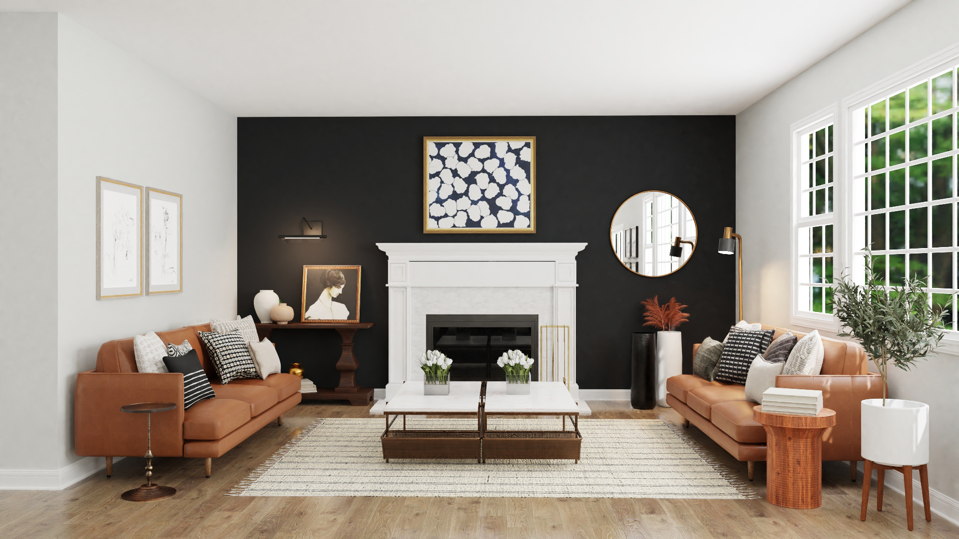
This versatile color can create a modern and sophisticated look or a cozy and inviting feel, depending on how it's paired with other elements of the room. Other popular choices include shades of blue, which can evoke a calming and serene atmosphere, and neutral tones such as beige and ivory, which provide a classic and timeless feel. It's also worth considering accent walls or adding pops of color through accessories to add depth and interest to your living room.
No matter which color you choose, it's essential to stay true to your personal style and make sure it reflects your home's overall design.
While trends come and go, some paint colors remain a popular choice for living rooms year after year.
Currently, the most popular paint color for living rooms is a soft, warm grey.
This versatile color can create a modern and sophisticated look or a cozy and inviting feel, depending on how it's paired with other elements of the room. Other popular choices include shades of blue, which can evoke a calming and serene atmosphere, and neutral tones such as beige and ivory, which provide a classic and timeless feel. It's also worth considering accent walls or adding pops of color through accessories to add depth and interest to your living room.
No matter which color you choose, it's essential to stay true to your personal style and make sure it reflects your home's overall design.
In Conclusion
:extract_focal()/https://pocket-syndicated-images.s3.amazonaws.com/articles/5304/1596722483_at_housetours_2019-06_VivY-RhiannonSouthwell_AT_rhiannon_vivyapp-12.jpg) Ultimately, the most popular paint color for your living room will depend on your personal style, the size and layout of your room, and the other elements in your home's design. Regardless of the color you choose,
it's crucial to take your time and carefully consider all factors to ensure that you create a space that is not only aesthetically pleasing but also reflects your unique personality and style.
So go ahead and experiment with different colors, and remember, a fresh coat of paint is an easy and cost-effective way to transform your living room and give it a whole new look.
Ultimately, the most popular paint color for your living room will depend on your personal style, the size and layout of your room, and the other elements in your home's design. Regardless of the color you choose,
it's crucial to take your time and carefully consider all factors to ensure that you create a space that is not only aesthetically pleasing but also reflects your unique personality and style.
So go ahead and experiment with different colors, and remember, a fresh coat of paint is an easy and cost-effective way to transform your living room and give it a whole new look.