Blue and orange may seem like an unlikely pair, but when used as complementary paint colors for a living room, they create a dynamic and eye-catching color scheme. The coolness of blue and warmth of orange create a perfect balance in any space. Consider using a light blue on the walls and incorporating pops of orange through pillows, curtains, or accent pieces for a playful and inviting feel. You can also use a darker shade of blue and pair it with a burnt orange for a more sophisticated and elegant look.Blue and Orange


Blue and Orange


Green and red are complementary colors that are often associated with the holiday season, but they can also work well together in a living room setting. The key to making this color combination work is to use muted and earthy tones rather than bright and vibrant ones. Think deep forest green and rusty red for a cozy and inviting feel. You can also use a lighter shade of green, such as sage, and pair it with a soft rosy red for a more subtle and calming look.Green and Red


Green and Red


Purple and yellow are two bold and vibrant colors that can create a stunning contrast in a living room. When using these colors together, it's important to balance them out so one doesn't overpower the other. You can achieve this by using a deeper shade of purple, such as eggplant, on the walls and incorporating pops of yellow through decorative accents. Alternatively, you can use a lighter shade of purple, like lavender, and pair it with a bright and sunny yellow for a cheerful and playful feel.Purple and Yellow


Purple and Yellow


Gray and beige may seem like neutral and dull colors, but when used together as complementary paint colors, they can create a sophisticated and timeless look in a living room. These colors work well together because they both have warm and cool undertones that balance each other out. Consider using a light gray on the walls and incorporating beige through furniture, curtains, or rugs for a classic and elegant feel. You can also use a darker shade of gray and pair it with a creamy beige for a cozy and inviting atmosphere.Gray and Beige


Gray and Beige

:max_bytes(150000):strip_icc()/repose_SW-56a192415f9b58b7d0c0bdbc.png)


/BM-Allys-56a192415f9b58b7d0c0bdb8.png)

Teal and coral are two bright and bold colors that can work surprisingly well together as complementary paint colors for a living room. The key to making this color combination work is to use them in moderation. Consider using a soft and muted shade of teal on the walls and incorporating pops of coral through decorative accents like throw pillows, artwork, or vases. You can also use a brighter shade of teal and pair it with a softer coral for a playful and vibrant look.Teal and Coral


Teal and Coral


Navy and mustard are two colors that may not seem like an obvious choice for a living room, but when used together, they can create a bold and sophisticated look. The deep richness of navy pairs well with the warmth of mustard, creating a perfect balance in any space. Consider using a navy blue on the walls and incorporating mustard through furniture or decorative accents for an elegant and timeless feel. You can also use a lighter shade of navy, like indigo, and pair it with a brighter mustard for a more playful and modern look.Navy and Mustard


Navy and Mustard


Burgundy and sage are two colors that exude elegance and charm, making them a perfect pair for a living room. The deep and rich burgundy adds warmth and depth to a space, while the soft and calming sage brings balance and tranquility. Consider using a burgundy accent wall and incorporating sage through furniture, curtains, or decorative accents for a cozy and inviting feel. You can also use a lighter shade of burgundy, like maroon, and pair it with a muted sage for a more subtle and sophisticated look.Burgundy and Sage


Burgundy and Sage


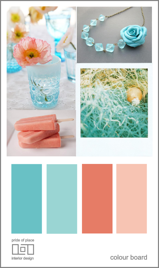
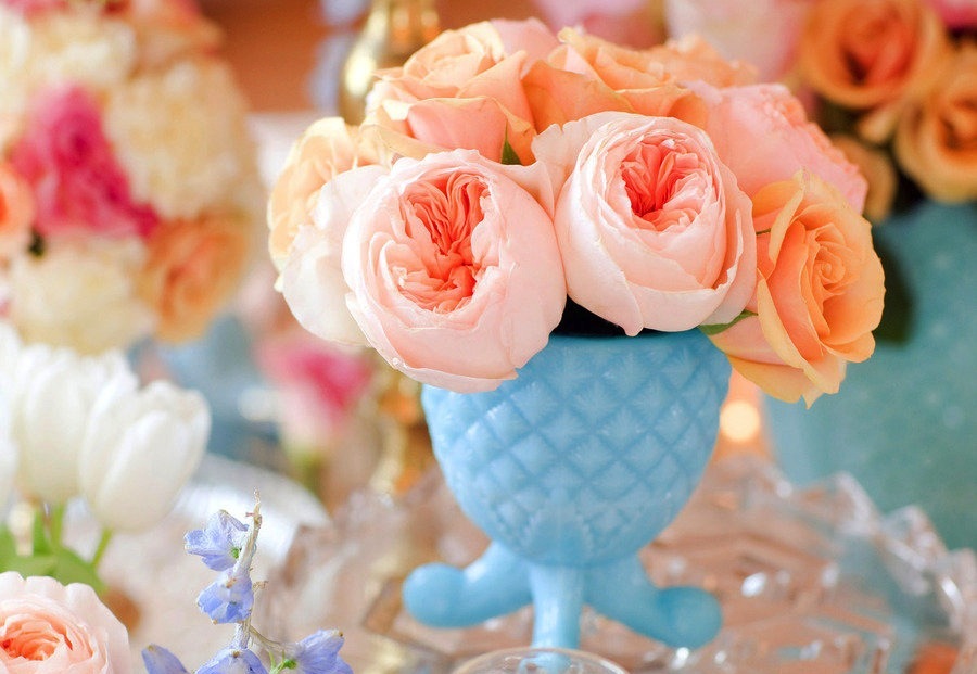
Turquoise and peach are two colors that may seem like an unlikely pair, but when used together, they create a refreshing and charming color scheme. The coolness of turquoise complements the warmth of peach, creating a perfect balance in a living room. Consider using a soft and muted turquoise on the walls and incorporating pops of peach through decorative accents for a calming and inviting atmosphere. You can also use a brighter shade of turquoise and pair it with a softer peach for a fun and playful look.Turquoise and Peach


Turquoise and Peach


.jpg?mode=max)
Lavender and gold are two colors that exude luxury and sophistication, making them a perfect combination for a living room. The soft and calming lavender pairs well with the richness of gold, creating a regal and elegant feel. Consider using a light lavender on the walls and incorporating gold through decorative accents like mirrors, frames, or lamps for a glamorous and chic look. You can also use a deeper shade of lavender, like lilac, and pair it with a brighter gold for a more modern and playful feel.Lavender and Gold


Lavender and Gold


Chocolate and cream are two warm and inviting colors that can create a cozy and comfortable living room. The richness of chocolate adds depth and warmth to a space, while the softness of cream brings a sense of calm and tranquility. Consider using a dark chocolate on the walls and incorporating cream through furniture, curtains, or decorative accents for a classic and timeless feel. You can also use a lighter shade of chocolate, like cocoa, and pair it with a creamy off-white for a more subtle and contemporary look.Chocolate and Cream


Chocolate and Cream

/easy-chocolate-ice-cream-recipe-1945798-hero-01-45d9f26a0aaf4c1dba38d7e0a2ab51e2.jpg)


Why Choosing Complementary Paint Colors For Your Living Room is Essential for Your House Design
 When it comes to designing your living room, one of the most important elements to consider is the paint color. The color of your walls can greatly impact the overall look and feel of your living space. That's why it's crucial to choose complementary paint colors that not only match your personal style, but also create a cohesive and inviting atmosphere. In this article, we will discuss the importance of complementary paint colors for your living room and provide some tips on how to choose the perfect colors for your home.
The Power of Complementary Colors
 Complementary colors are colors that are opposite each other on the color wheel. These colors, when placed together, create a striking contrast and can make a room feel more dynamic and visually appealing. In the context of house design, complementary paint colors can add depth and dimension to your living room, making it look more spacious and inviting.
One of the main benefits of using complementary paint colors in your living room is that they can create a sense of balance and harmony in your space.
By choosing colors that are opposite each other on the color wheel, you can create a visually pleasing color scheme that is both eye-catching and well-balanced. This is especially important in the living room, as it is often the main gathering space in a house and needs to feel inviting and comfortable for both residents and guests.
Complementary colors are colors that are opposite each other on the color wheel. These colors, when placed together, create a striking contrast and can make a room feel more dynamic and visually appealing. In the context of house design, complementary paint colors can add depth and dimension to your living room, making it look more spacious and inviting.
One of the main benefits of using complementary paint colors in your living room is that they can create a sense of balance and harmony in your space.
By choosing colors that are opposite each other on the color wheel, you can create a visually pleasing color scheme that is both eye-catching and well-balanced. This is especially important in the living room, as it is often the main gathering space in a house and needs to feel inviting and comfortable for both residents and guests.
Tips for Choosing Complementary Paint Colors
 When selecting complementary paint colors for your living room, there are a few things to keep in mind. First, consider the overall theme and style of your home.
It's important to choose complementary colors that will complement your existing furniture and decor
, rather than clash with it. For example, if you have a lot of warm-toned furniture, consider using cool-toned complementary colors on your walls to create a balanced look.
Another tip is to consider the amount of natural light in your living room.
Lighting can greatly affect the appearance of paint colors
, so it's important to choose shades that will look good in both natural and artificial light. If your living room has a lot of natural light, you may want to opt for lighter shades of complementary colors to avoid making the space feel too dark.
When selecting complementary paint colors for your living room, there are a few things to keep in mind. First, consider the overall theme and style of your home.
It's important to choose complementary colors that will complement your existing furniture and decor
, rather than clash with it. For example, if you have a lot of warm-toned furniture, consider using cool-toned complementary colors on your walls to create a balanced look.
Another tip is to consider the amount of natural light in your living room.
Lighting can greatly affect the appearance of paint colors
, so it's important to choose shades that will look good in both natural and artificial light. If your living room has a lot of natural light, you may want to opt for lighter shades of complementary colors to avoid making the space feel too dark.
Final Thoughts
 Choosing complementary paint colors for your living room is an essential part of house design.
By using the power of complementary colors, you can create a visually appealing and well-balanced living space that reflects your personal style
. Remember to consider your existing furniture and lighting when selecting colors, and don't be afraid to get creative and experiment with different shades. With the right complementary paint colors, you can transform your living room into a beautiful and inviting space that you and your guests will love.
Choosing complementary paint colors for your living room is an essential part of house design.
By using the power of complementary colors, you can create a visually appealing and well-balanced living space that reflects your personal style
. Remember to consider your existing furniture and lighting when selecting colors, and don't be afraid to get creative and experiment with different shades. With the right complementary paint colors, you can transform your living room into a beautiful and inviting space that you and your guests will love.