The 1970s were a time of change and self-expression. This was reflected not only in fashion and music, but also in interior design. The living room, being the heart of the home, was a prime spot for homeowners to experiment with bold and vibrant colors. In this article, we will take a trip down memory lane and explore the top 10 living room colors that were popular in the 1970s.The 1970s: A Decade of Bold and Vibrant Living Room Colors


Avocado Green
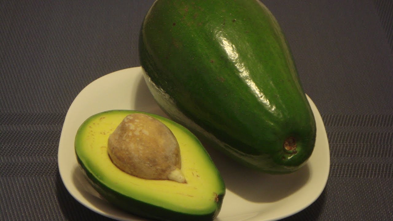
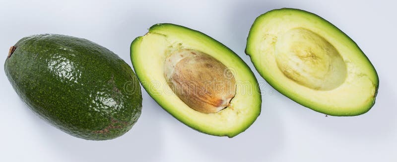


This shade of green was everywhere during the 1970s. It was a staple in many living rooms, giving off a natural and earthy vibe. Avocado green was often paired with other earthy tones such as browns and oranges, creating a warm and cozy atmosphere. It was also a popular color for appliances such as refrigerators and stoves, adding a touch of retro charm to any home.Avocado Green
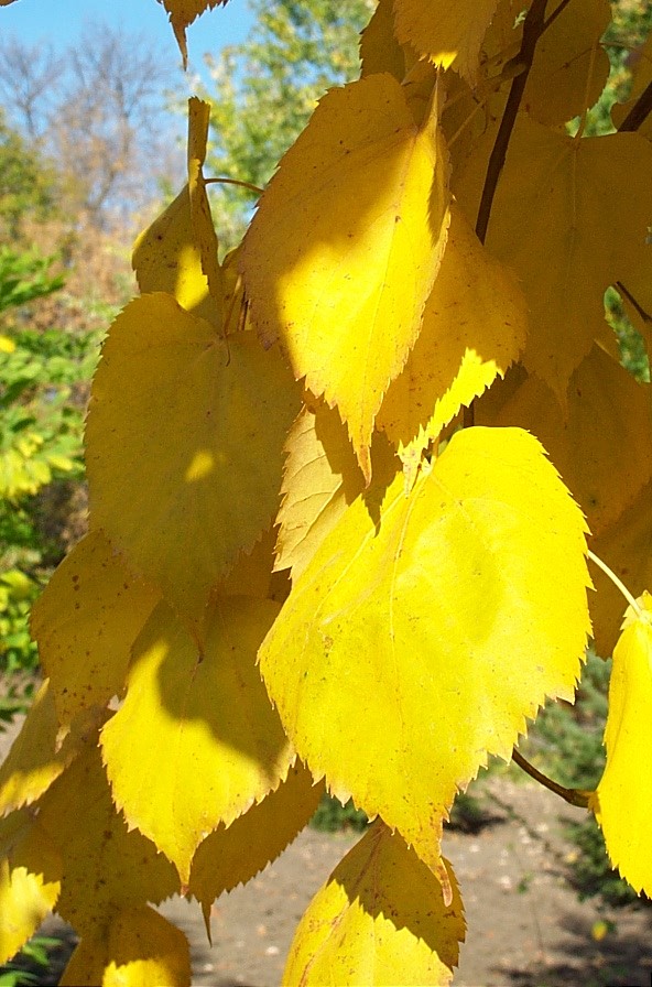

Harvest Gold


Another popular color of the 1970s was harvest gold. This warm and sunny shade was often used in combination with avocado green, creating a bold and eye-catching color scheme. Harvest gold was also a popular choice for kitchen appliances, adding a pop of color to an otherwise neutral space.Harvest Gold


Burnt Orange


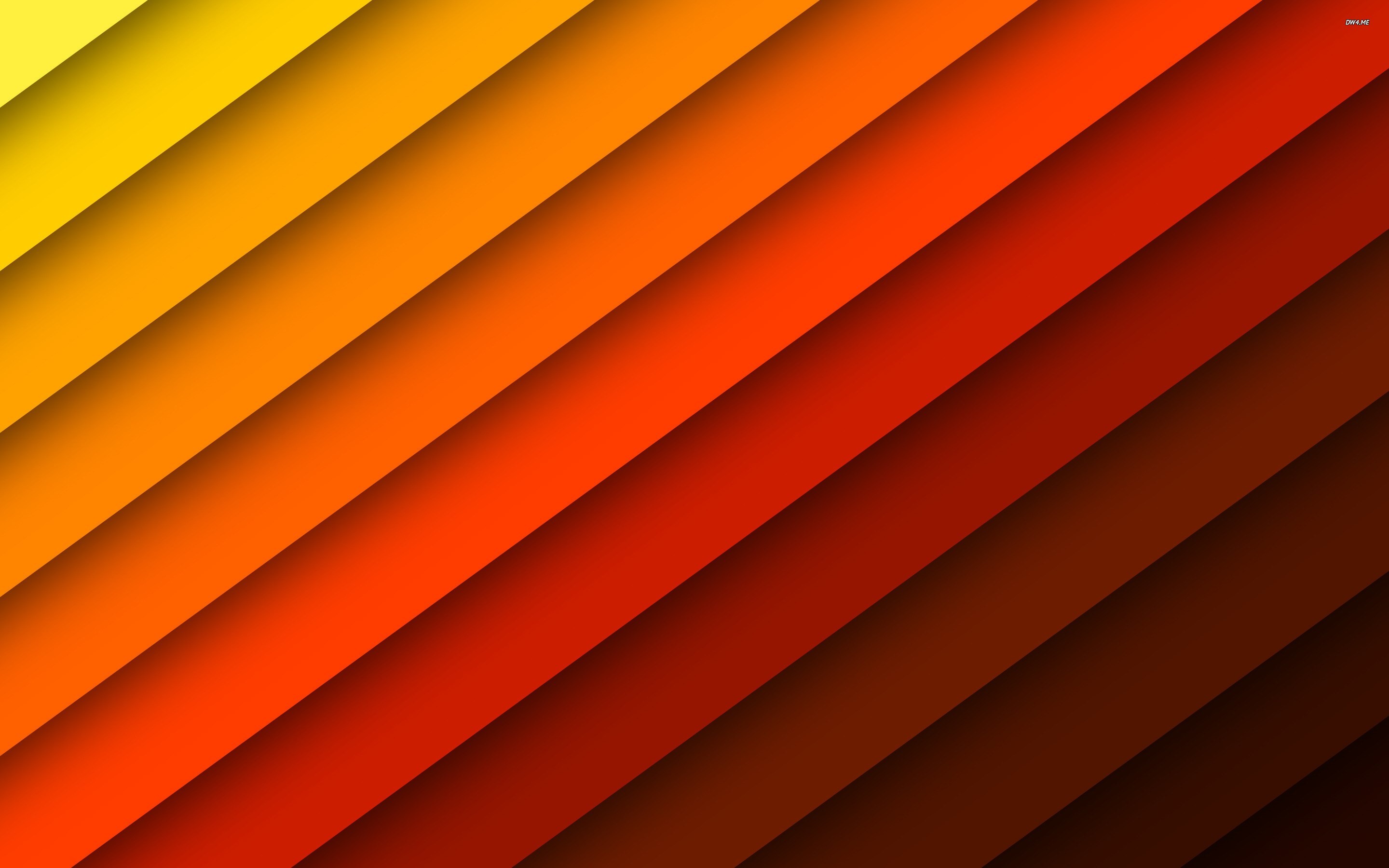


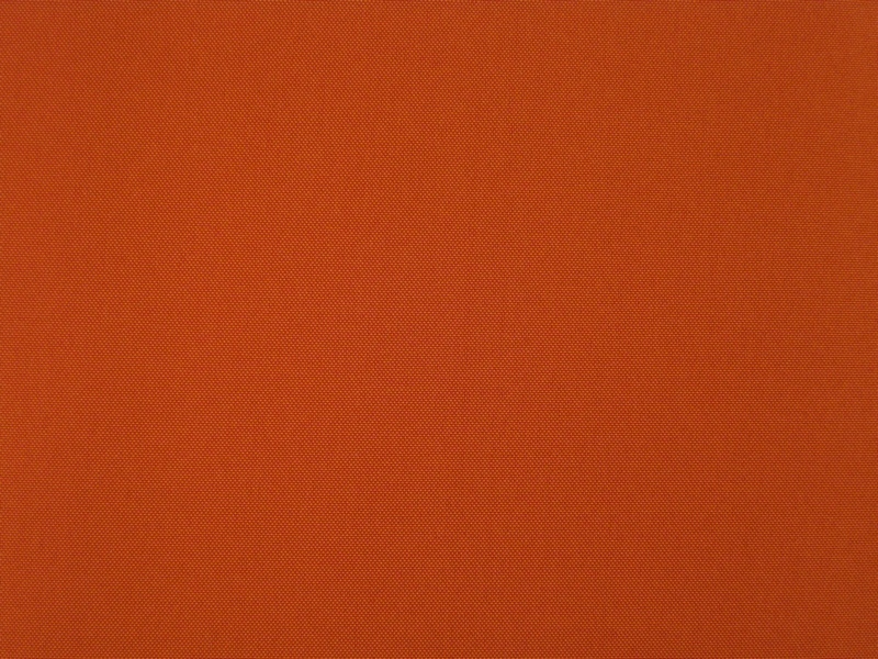
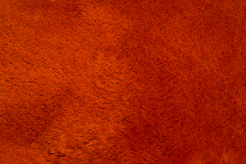
Burnt orange was a color that represented the free-spirited and bohemian vibe of the 1970s. This rich and warm color was often used as an accent color in living rooms, bringing a touch of energy and warmth to the space. It was also a popular choice for furniture upholstery, adding a bold and dramatic statement to any room.Burnt Orange


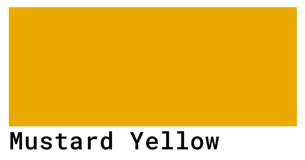
Mustard Yellow


/close-up-of-yellow-mustard-seeds-and-sauce-on-table-902484156-5bc65e6c4cedfd0051ef9711.jpg)
Mustard yellow was another popular color that added a burst of sunshine to living rooms in the 1970s. This vibrant hue was often used in combination with other warm colors such as burnt orange and harvest gold, creating a harmonious color palette. It was also a popular choice for accessories such as throw pillows and curtains, adding a pop of color to any room.Mustard Yellow


Chocolate Brown

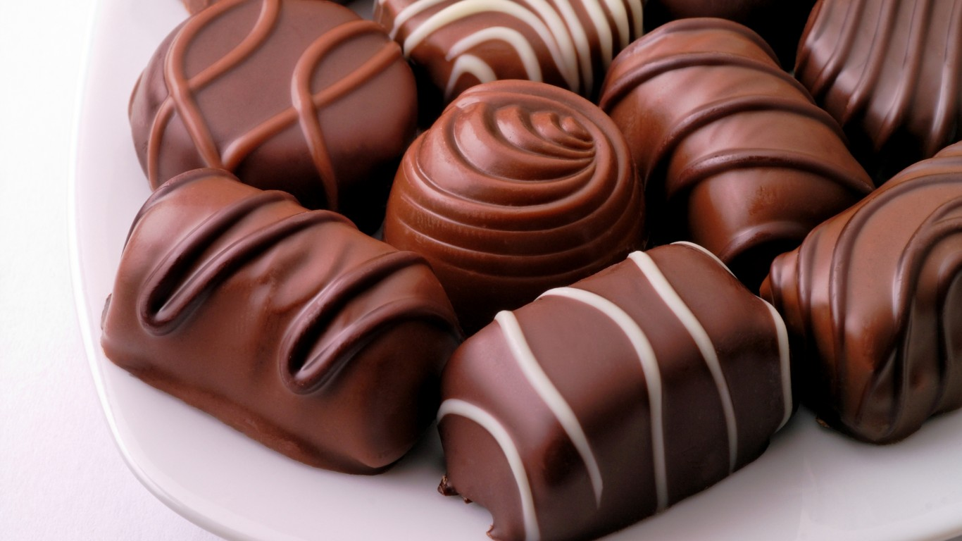


While the 1970s was all about bold and vibrant colors, there was also a place for more subdued tones like chocolate brown. This rich and warm color was often used as a neutral base, allowing other colors to pop and stand out. It was also a popular choice for furniture and flooring, adding a touch of sophistication to any living room.Chocolate Brown


Brick Red
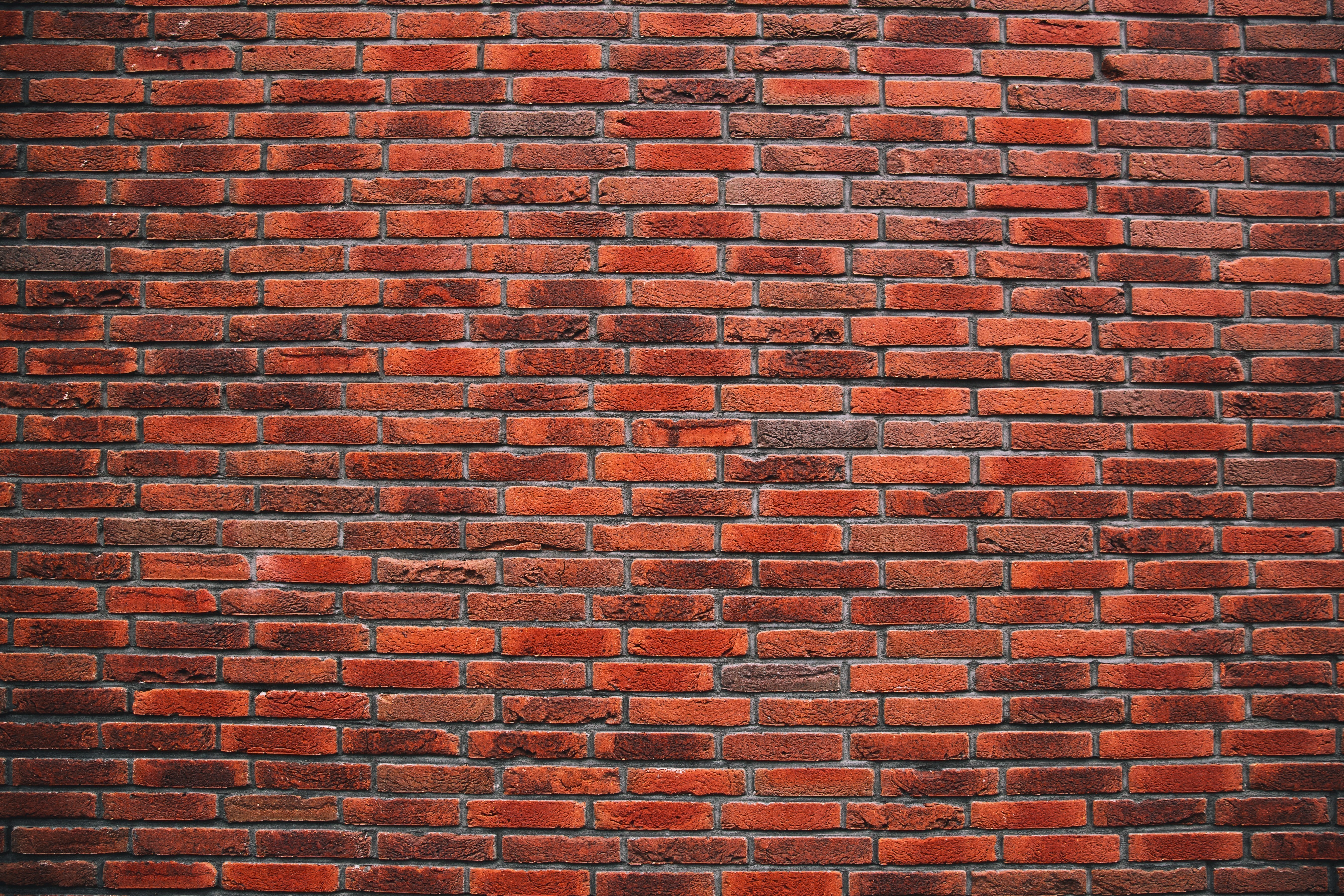

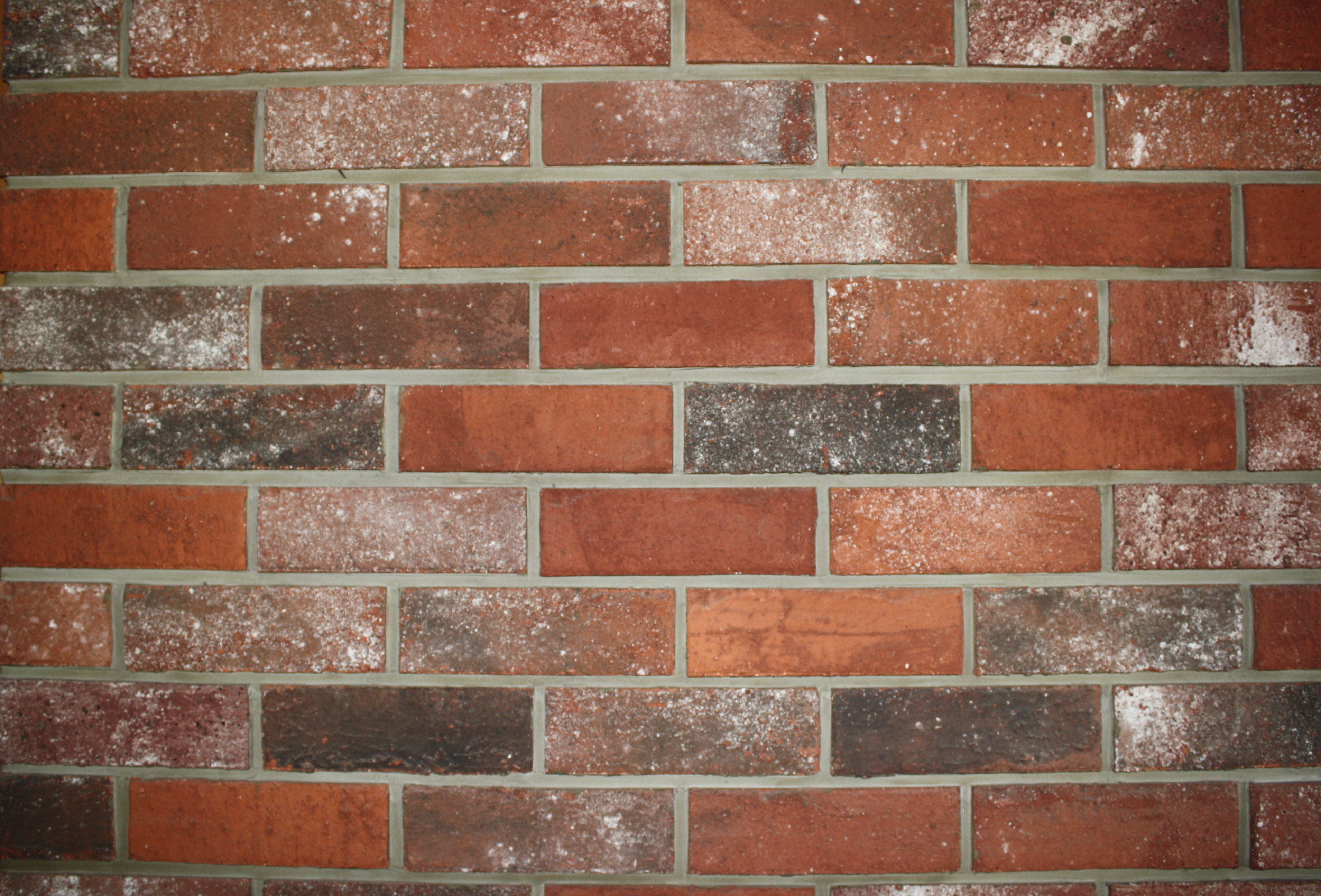

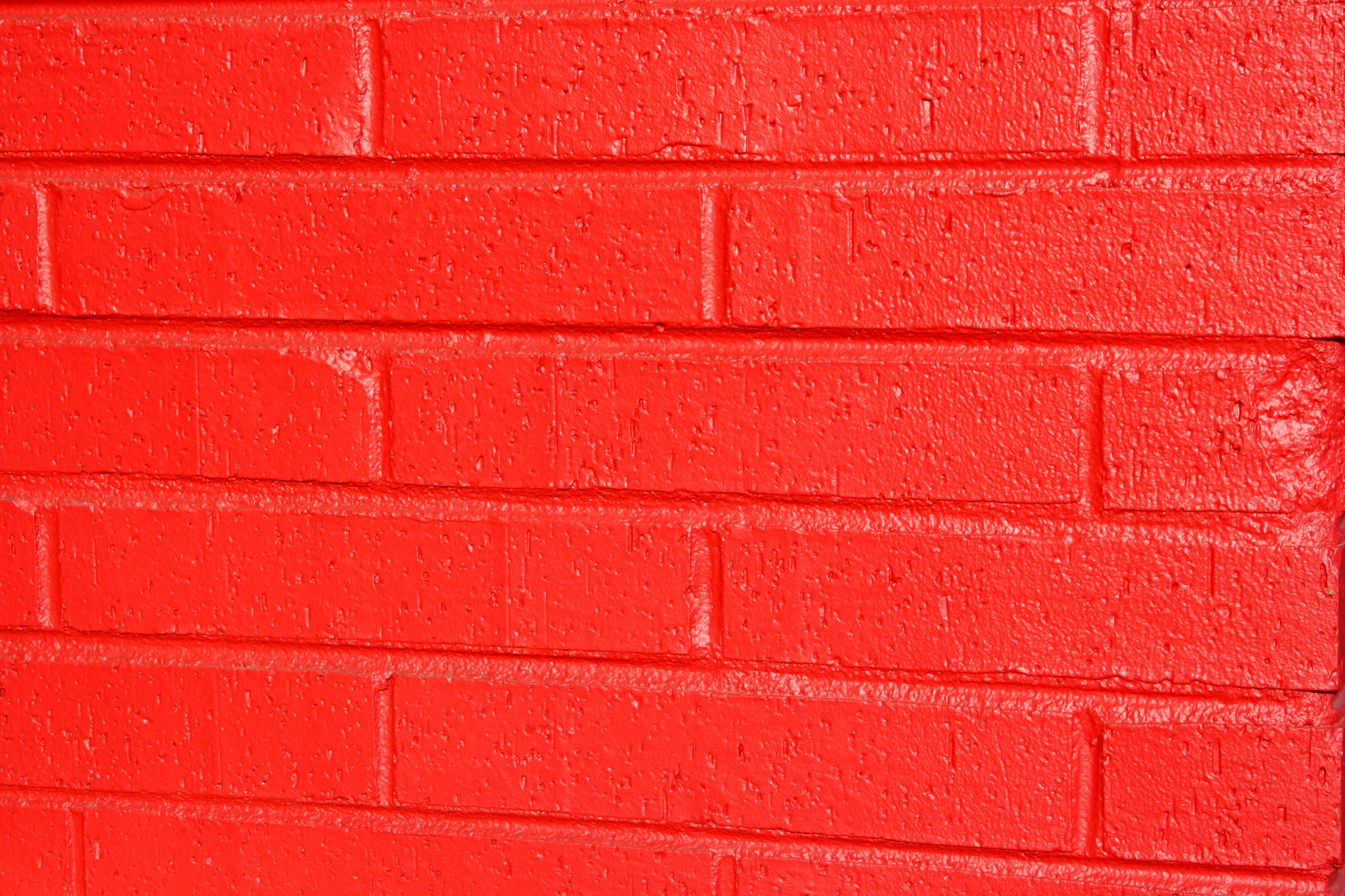
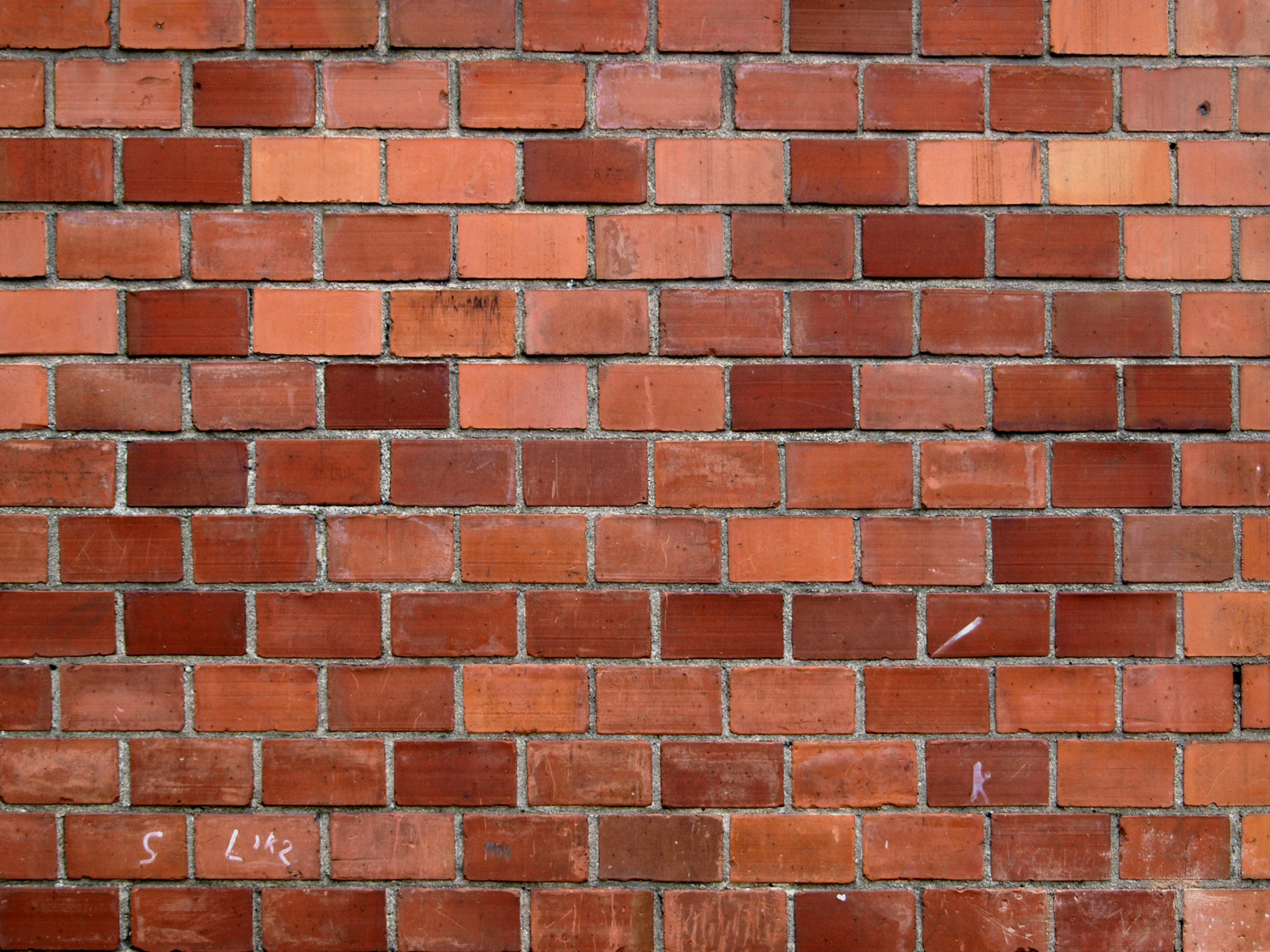
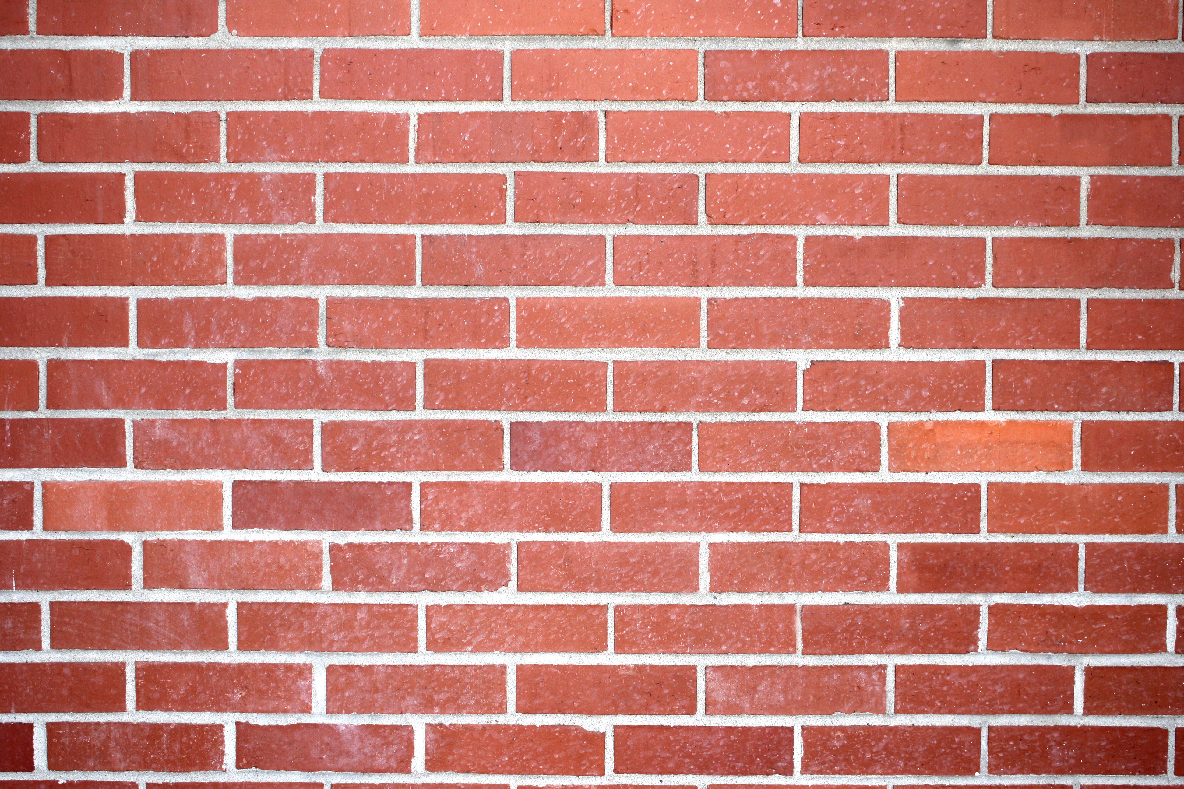
Brick red was a color that added a touch of drama and intensity to living rooms in the 1970s. This deep and rich hue was often used as an accent color, creating a bold statement against more neutral colors. It was also a popular color for accent walls, adding a touch of warmth and depth to any space.Brick Red


Olive Green
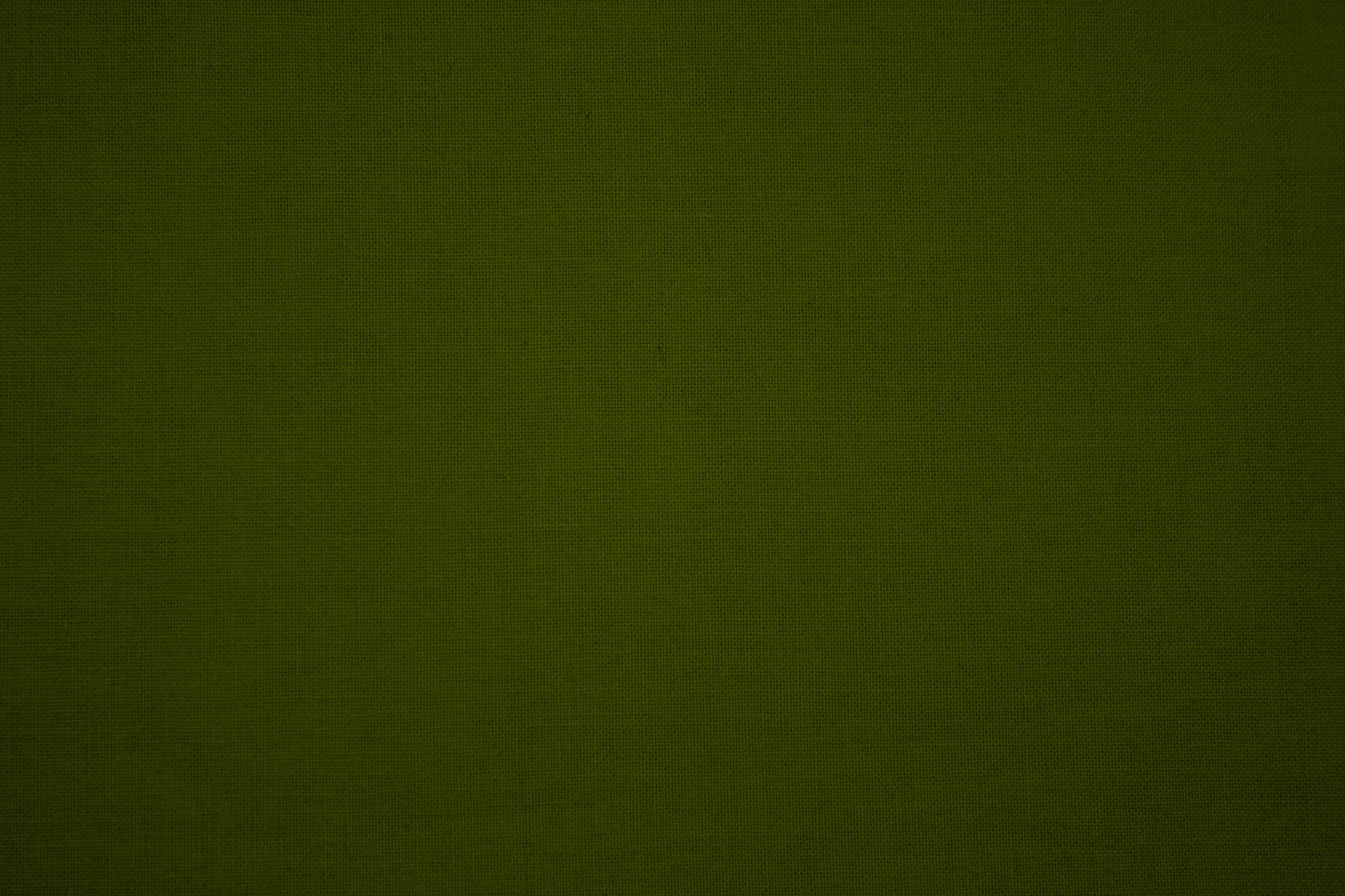


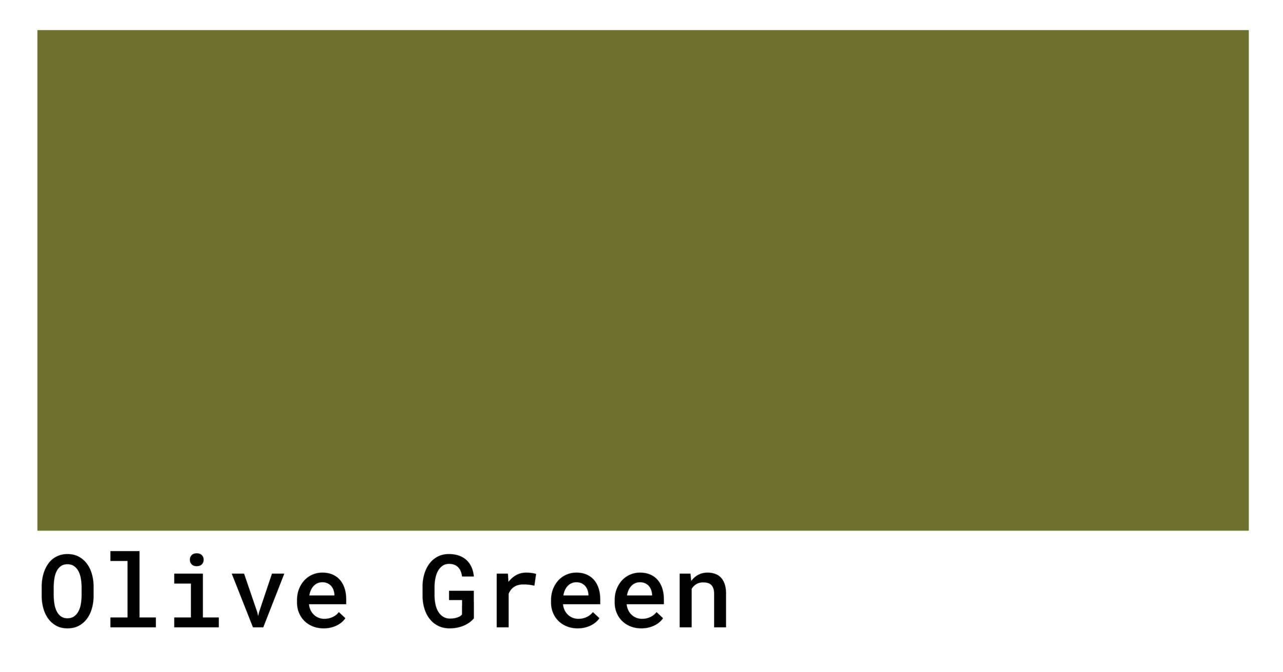


Olive green was another earthy hue that was popular in the 1970s. This muted and natural color was often used in combination with other earth tones, creating a warm and cozy atmosphere. Olive green was also a popular choice for furniture upholstery, adding a touch of retro charm to any living room.Olive Green


Earth Tones
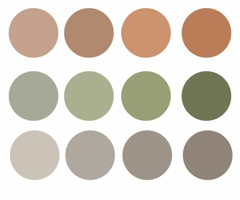


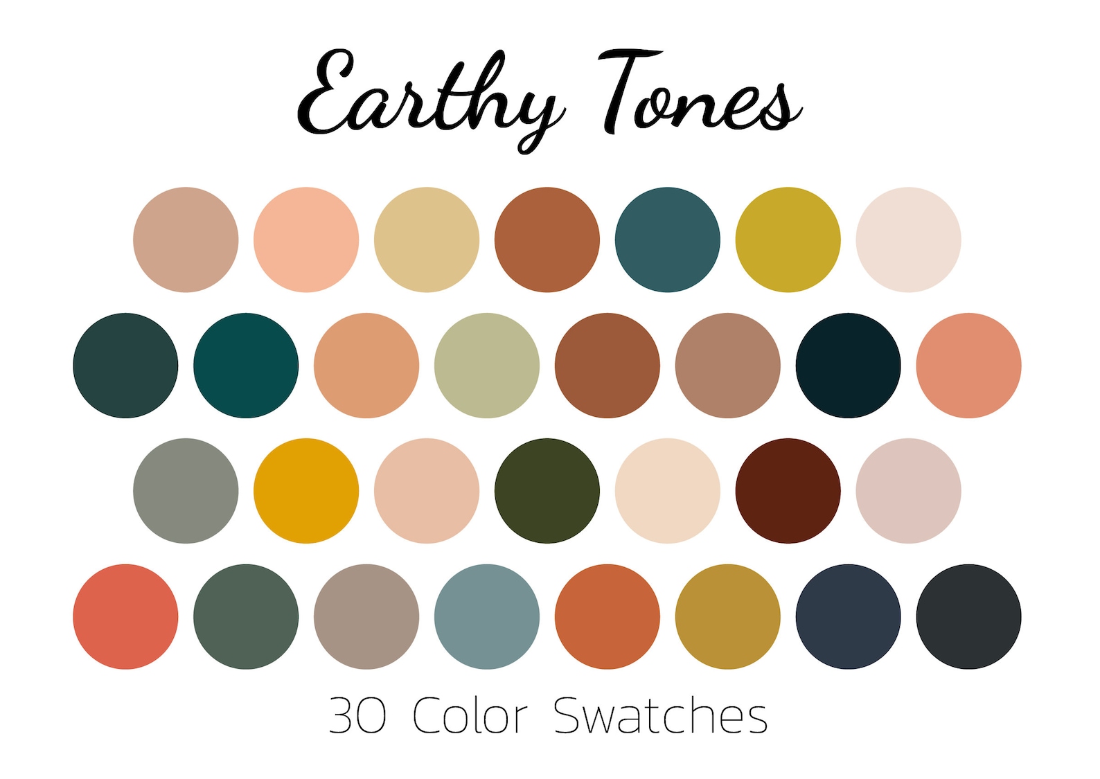

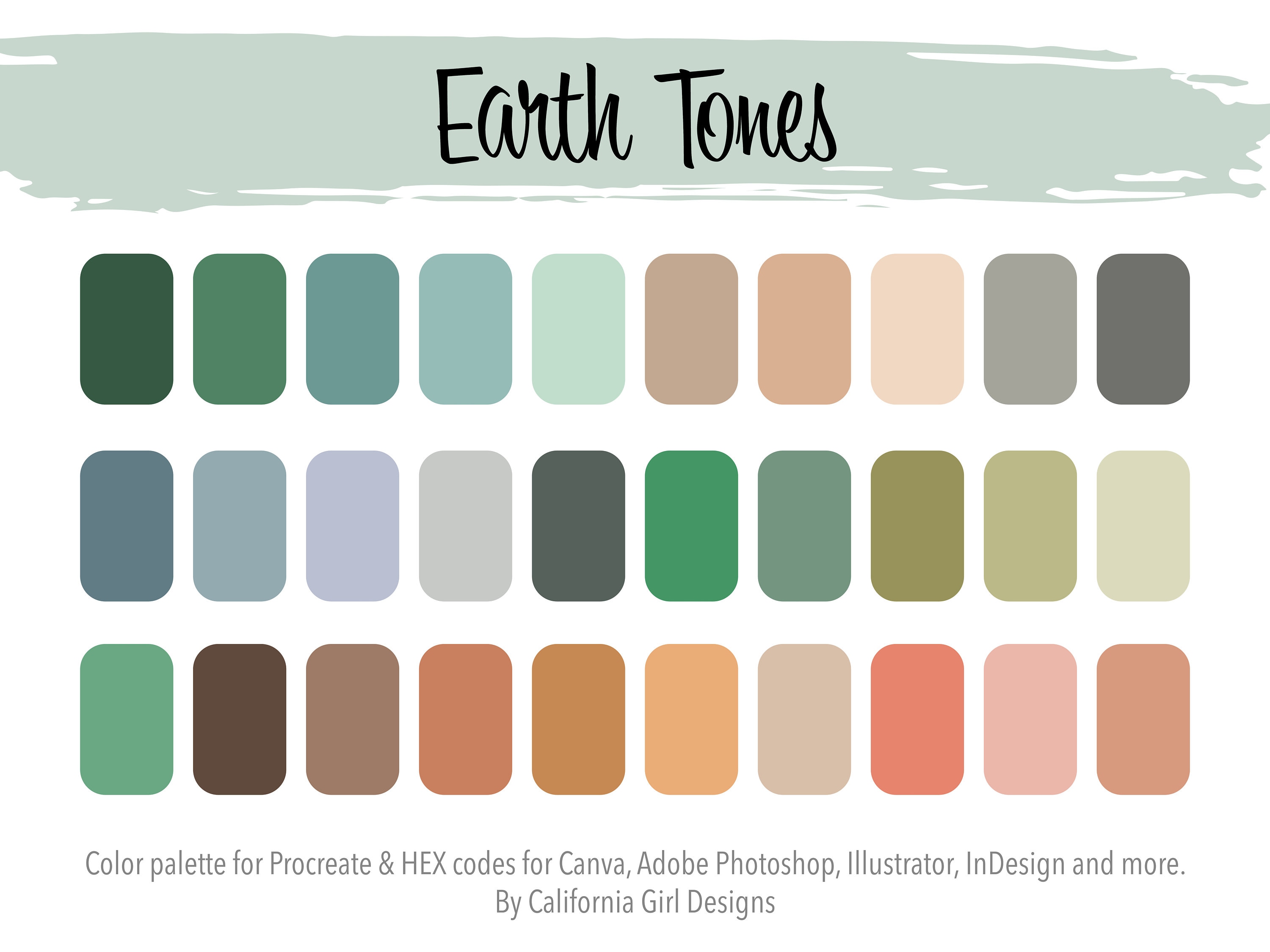


The 1970s was all about being in touch with nature, and this was reflected in the popular color choices for living rooms. Earth tones such as browns, greens, and oranges were used to create a warm and inviting atmosphere. This color palette brought the outdoors inside and added a touch of natural beauty to living spaces.Earth Tones


Warm Neutrals

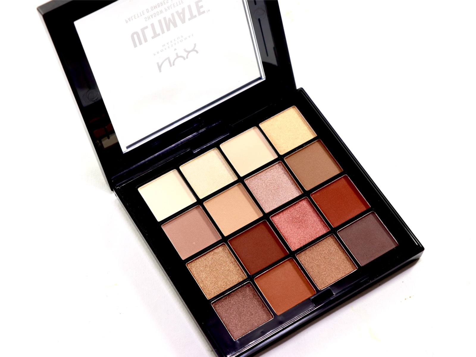

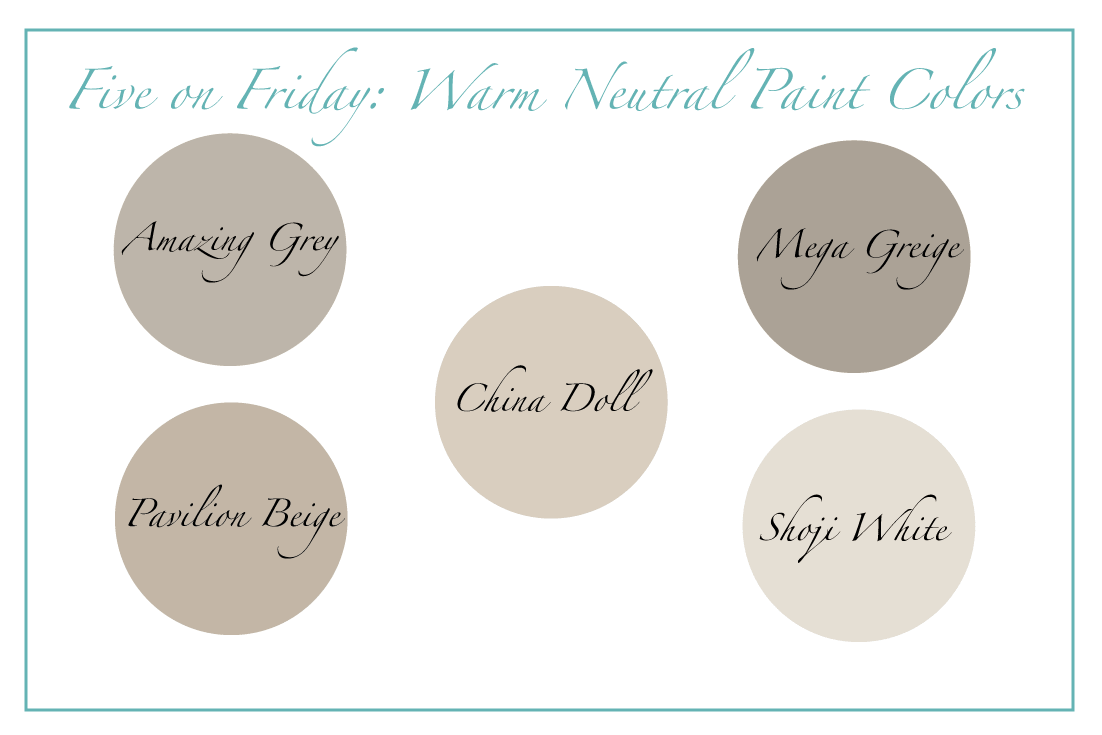

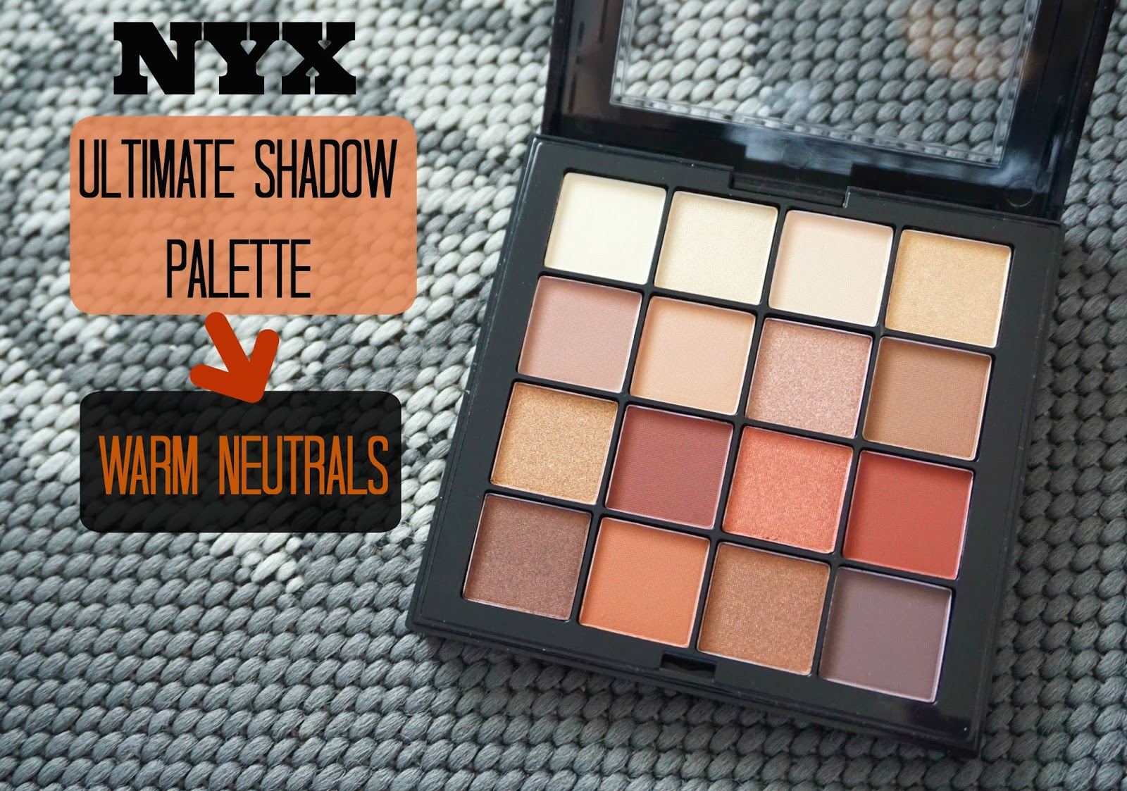

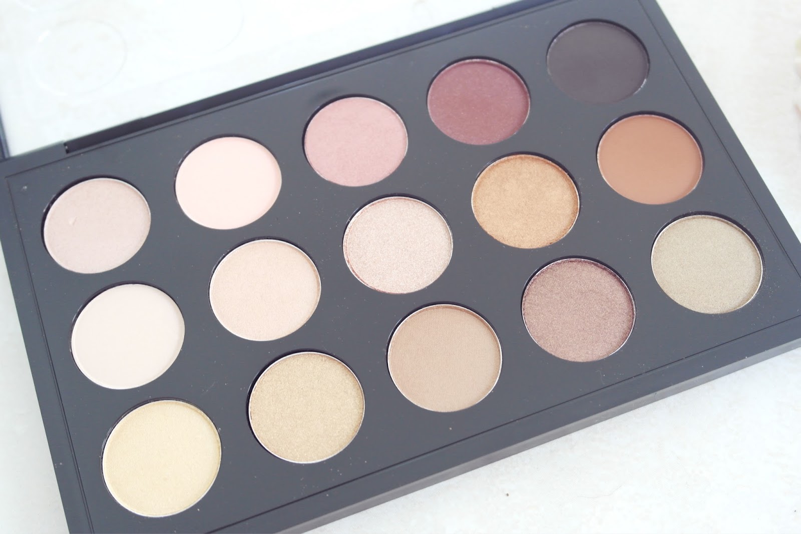

Neutral colors were also a popular choice for living rooms in the 1970s. Warm tones such as beige, cream, and tan were used to create a cozy and inviting space. These neutral hues were often paired with bold accent colors, creating a balanced and harmonious color scheme.Warm Neutrals


Pop Art Colors


The Influence of 1970s Living Room Colors on House Design
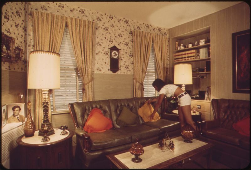
The 1970s was a decade of bold and vibrant colors, and this was reflected in the design of living rooms. These bold color choices had a significant influence on house design, and even today, they continue to inspire designers and homeowners alike. Let's take a closer look at the impact of 1970s living room colors on house design.

One of the main keywords that defined living room colors in the 1970s was "earth tones." These included shades of brown, green, and orange, which were often used in combination to create a warm and inviting atmosphere in the living room. These colors were a reflection of the growing environmental movement at the time, with a focus on natural and organic elements in home design.
Another keyword that defined the 1970s was "avocado green." This color was hugely popular and could be found on everything from appliances to furniture to walls. It was a bold and unconventional choice that added a pop of color to any living room. Along with avocado green, other bright colors like mustard yellow and burnt orange were also commonly used, adding a sense of energy and excitement to the space.
The use of bold and vibrant colors in the 1970s was a reflection of the changing social and cultural landscape. The decade was marked by a sense of rebellion and breaking away from traditional norms, and this was evident in the design of living rooms. The use of bright colors was a way to express individuality and create a space that was unique and personal.
Today, the influence of 1970s living room colors can still be seen in modern house design. The use of earth tones and bold colors continues to be a popular choice for homeowners looking to add character and personality to their living space. Designers often incorporate these colors in a more subtle way, using them as accents or in combination with other, more neutral shades.
In conclusion, the 1970s was a decade that left a lasting mark on house design, particularly in the use of living room colors. The bold and vibrant choices of this era continue to inspire and influence designers and homeowners, showcasing the enduring power of color in home design.